Pages

Tuesday, July 31, 2012

colourQ 148

Hello and welcome to what I like to call colourQ Tuesday!  Once again (and no surprise) Arielle has found a delightful color combo and an equally delightful image graphic to get your mojo-licious juices flowing.

For my card I inked up a new stamp set called Pleasant Poppies, which is absolutely perfect for this color challenge.  I think poppies are their most striking when they are that orangey-red color!  Here's my take:


Inspired by this pattern I tried making a card with some colorful hexagons but what I designed looked pretty awful so I scrapped it and went with the poppies instead.  My interesting layout is courtesy of the Sweet Sunday Sketch Challenge.


Be sure to check out the inspiration from the colourQ design team because every card you'll see is a complete knockout!  Then I hope you play along with us!

Sunday, July 29, 2012

retro sketches 22 with Dynamic Duos 13

Today has dawned rainy and I figure that's as good excuse as any to spend some time with stamps and ink.  If I'm lucky I should be able to get quite a few cards knocked out today for some upcoming challenges.  First I tackled the newest retro sketch and paired it with the colors at Dynamic Duos.


These earthy colors made me want to do something with leaves.  I've got quite a few leafy sets that I like to use but I chose Gently Falling because it's the one I probably use the least and I wanted to see what I could come up with.  I paired it with some DSP from Woodland Walk and a wee sentiment from Tiny Tags.

This is the first time I've used the new Argyle embossing folder and I really like it.  It's gives a good crisp image without tearing the cardstock and it has an interesting pattern.  I also added a bit of Crumb Cake taffeta ribbon with one of the new Ribbon Slides and I highlighted my leaves with an Antique Brad.

Well, I'm off to recharge with some coffee and breakfast, then it's back to "work" in my stamp room.  Thanks for stopping by!

Saturday, July 28, 2012

Color Throwdown 202

I've been eyeing the latest color challenge at Color Throwdown since it first went up on Wednesday.  Unfortunately, my mojo decided it needed a break and I spent the next two days sitting at my stamping desk wondering what in the world I was doing there!  Finally Friday night, inspiration struck!


I wish I'd done a few things differently with this card but I put it together at the same time I was watching the opening ceremony at the Olympics.  Honestly, it took me HOURS to make this simple card because the television was just too distracting!  But I was determined to get this done, so I persevered.  

There's not a lot to say about this.  The polka dotted DSP is Pool Party.  The Pool Party crimped and sponged butterfly was cut from the Beautiful Butterflies Bigz die and the smaller butterfly from Papillon Potpourri was stamped in Rich Razzleberry.  I added some Basic Rhinestones to the smaller butterfly because it needed a little bling!

Later today I'm off to a family reunion.  Our reunions started with my father's siblings and first cousins in 1975 (and of course, their extended families).  We continued the tradition until about three years ago when interest in attending seemed to be fizzling out.  Today's event is sort of a last hurrah.  We're all expecting a nice turnout for what could be the last time we all get together for a long while.  It will be bittersweet, I suspect.

Thanks for stopping by!

Thursday, July 26, 2012

Create With Connie and Mary 211

Welcome back to a new challenge at Create With Connie and Mary!  After a little Convention break we are back with a swanky new sketch challenge for you to try!


I thought that I'd been neglecting my new InColors for far too long, so I used some Midnight Muse and Summer Starfruit on this card.  I actually let the colors from the DSP I used, Comfort Cafe, guide me when putting this card together.

Then I turned to what is fast becoming one of my new favorite stamp sets, Everything Eleanor, for the focal point.  I stamped the flourish onto the Pool Party DSP then again onto a scallop circle and lined up the circle over the flourish.  The circle looked a little wan, so I sponged the edges with some Pool Party ink.  The flower was stamped in Jet Black Stazon and colored with a Summer Starfruit marker.  I added some Dazzling Details to the stamens on the flower and although it looks a little weird in the photo it looks VERY COOL in real life.  It adds shimmer, sparkle and texture all at the same time!

And speaking of Dazzling Details have you ever been annoyed that when you add your little blobs to your work you get that pointy, volcano-shaped cone?  Well, to round out the blob all you need to do is take the cardstock (the one with the annoying pointy, volcano-shaped cones), hold it horizontally, and flick the underside repeatedly with your fingers.  Flick your fingers the way you would flick a bug off your shirt!  The flicking spreads out the blob so that your pointy volcano is magically transformed into a gently rolling hill.

So now head on over to Create With Connie and Mary and check out the design team creations that are sure to get your creative juices flowing.  I hope you can join us this week!

Wednesday, July 25, 2012

Freshly Made Sketches 45

Happy Wednesday everyone!  Today over at Freshly Made Sketches the wonderfully talented Cindy has got a fantastic sketch for you that is a perfect way to show off all that patterned paper that I know you've been hoarding!  I went into my personal DSP vault and selected some retired paper called Cottage Wall for my card.


It seems like ages since I've used Old Olive, a color that I used a lot in days gone by, so that was a big motivator for me choosing this DSP.  I layered the pretty paper on cardstock then decided it needed a bit of jazzing up so I stitched it with a zig-zag.  I tried to channel my inner Jennifer who has an amazing knack for mixing up patterned DSP for maximum impact, but I'm not sure that I succeeded with my striped layer.  I like the added ribbon and baker's twine, but now that I'm studying it I wish I added a button.  Drat!

The pretty flower is from an old favorite Raining Flowers.  And in a sudden burst of inspiration I decided to substitute the sentiment for a row of brads.  There's just something about a row of brads that I really love and I thought they added some interesting texture.

I hope you have time to join us this week at Freshly Made Sketches.  Be sure to stop by and check out the amazing samples from the design team!


Tuesday, July 24, 2012

colourQ 147

When I first sat down to make my card for this week's colourQ challenge I was a little stumped.  I couldn't figure out what I wanted to do so I started looking through my stamp sets for inspiration.  That's when I spied the adorable Birthday Bunny stamp from The Cat's Pajamas.  


I think this bunny is about the cutest thing ever and I smile every time I see it.  I mean look at those big floppy ears.  Adorable!  I think this stamp is heaven sent for this challenge because coloring that big pile of gifts is the perfect way to show off these diverse hues.  And don't you just love the HB stamp from It's Your Birthday?  It's like text message shorthand for cards!  LOL!  {text message shorthand again}

And a funny thing happened on the way to making this card.  I was looking through my personal compendium of sketches that I keep around for inspiration and found one that I thought would be perfect for this stamp set.  But as I got going putting it all together it suddenly occurred to me that with a few tweaks it would be perfect for the sketch challenge at The Paper Players.

I did change it up a bit and made my card square, but other than that I remained true to this beautiful CAS sketch.  Sometimes lots of white space is just what the doctor ordered!

We've got a new face over on the colourQ blog so hop on over and say "hi."  I'm sure she's no stranger to you!  I have long admired Tracey's style and we're all very excited to have her join us!  And this week we also say goodbye to fellow DT member Suzanne who's got some exciting things of her own on the horizon!

Now that I've said my piece, you should pop on over to colourQ and see what the design team has cooked up for you this week.  I'm pretty definitely sure that you will be awed, amazed, and inspired to join us!


Monday, July 23, 2012

Dynamic Duos 12

I think there's something afoot in challenge land because I found another challenge that uses black!  This time it's Dynamic Duos who have paired the drama of black with a pop of color in Poppy Parade!


It seems like ages since I've used this PTI flower and since my first idea for the focal point of this card looked horrible, I decided that this flower needed to see some ink.  The layout for this sketch is from an old Card Patterns sketch that I stumbled upon when I visited their blog.  The sketch challenge is now defunct, but they very helpfully provide a link to all their sketches which is a wonderful thing when you need a little inspiration.

As I type this blog post, it's late at night and I've got all the windows shut in the house because we are supposed to be aerial-sprayed for mosquitos.  It's quite stuffy in here, I'm sweating and even the kitties are wondering why its so hot!  I'm tempted to open the windows anyways because I think was actually sprayed last night and I'm not sure I can sleep with all this heat!

Anyways, thanks for stopping by!


Saturday, July 21, 2012

CAS-ual Fridays 62 and Just Add Ink 127

The CAS-ual Fridays challenge and Just Add Ink challenge are a match made in heaven, so I took this as a sign that I needed to participate.  The CFC62 challenge was to use black as a card base and at JAI127 we are to use black, white, and a color of our choice.  I picked Summer Starfruit.


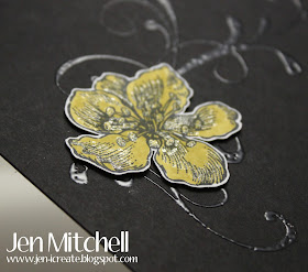
I stamped the flourish from Everything Eleanor in Versarmark then went over it with clear embossing powder.  I experimented with layering the flower from that set, but it looked horrible so I just used the biggest one that I colored with a marker.  I thought it needed a little something extra so I went over it with a clear atyou Spica pen.

I popped up the flower using Deanna's Dots.  I love these things.  They're about half as thick as a dimensional and perfect when you want something popped up just a tad.  I think this picture shows it a little better.


And since the glitter from the Spica pen is still somewhat elusive in these pics I tried one last one to show that off.  Not a great picture, but I think you get the idea.


Well, I'm off to run some errands then to enjoy this beautiful sunshine by relaxing on the patio.  Thanks for stopping by!

Thursday, July 19, 2012

CASology 2

I stumbled upon a new challenge site called CASology.  They are all about clean and simple cards and each week they add a "cue" as a theme.  I missed their inaugural sketch last week, but this week the cue is "happy."  Easy peasy, right?


I went super CAS and stamped a faux stitched outline with a stamp set from CTMH in Basic Gray, then I stamped one of the grunge stamps from Clockworks and a butterfly from Papillon Potpourri. The butterfly was stamped once directly onto the card base then again onto a piece of scrap Whisper White and punched out with the corresponding punch.  I layered them together and added some Basic Rhinestones to jazz up the butterfly!  (My layout is actually from a FTL sketch from May, that I especially love and have used quite a bit since).  The sentiment is from Happy Moments.

Thanks for stopping by!

Wednesday, July 18, 2012

Freshly Made Sketches 44

Welcome to Wednesday and a new sketch from Freshly Made Sketches.  This week it's a sketch from yours truly!

Now the funny thing is that when I saw this sketch on our design team blog, I thought "holy moly, what was I thinking?"  But once I sat down at my desk to attack this sketch make my card, I figured it wasn't really all that bad.  I did change it up a bit and made a square card instead of a rectangle.


One fun thing about my card is that it is chock-a-block full of sneak peaks from the new mini that is due out August 1st!  The gorgeous leaves and acorn with their rock-and-roll color are from Wonderfall (I can't seem to resist a stamp set with leaves in it) and the lively and colorful DSP is from Orchard Harvest (which I've already used twice in the short time I've had it and that generally means that I really love it).  I even managed to sneak in a Brushed Bronze Designer Button tied with a bit of baker's twine.  I wanted a simple sentiment for this card and waffled a bit about what to use, but ended up with the clean "thank you" from Just Believe.

Now head on on to Freshly Made Sketches and check out the cards from the design team who, judging by the fabulous cards they've made, didn't have nearly as hard a time with this sketch as I did!  Here's a handy-dandy list for you:


Tuesday, July 17, 2012

colourQ 146

So, I've been trying to think a little outside my usual box lately when it comes to making a card.  For today's colourQ challenge I inked up some stamps that are definitely not my norm!  As usual, Arielle has found some scrumptious colors for our inspiration, so how could I not be inspired to try something new?!


Last week I went to my not-so-local Joann and found some cool Tim Holtz stamps on the clearance rack (that would be the Kraft argyle stamp on the card on the card here).  I followed this up with the grungy stamp from Clockworks and the little hexagons from PTI. My layout is from the latest retro sketch.


I'm kind of liking this fun look here.  These colors and this sketch are perfect together, I say to myself!  Now since it's the beginning of a new colourQ week, you've got to pop on over there and check out the inspiration from the design team.  I'm sure it will inspire you to take up some cardstock and ink and play along with us!  

And thanks for stopping by to take a look!


Sunday, July 15, 2012

Dynamic Duos 11 and Less is More 76

Today is the last day of my vacation before I have to return to work.  I'm rather sad about this because I love being home in the summer when the weather is hot, I can smell the flowers in my garden from my kitchen window, and I can laze around and do nothing if I want.  Of course, vacations at my house are usually quite busy as I try to accomplish all the odd jobs that I never seem to do when I'm working, but I still managed to find time to stamp just about every day!

My card today features the Dynamic Duo colors of Pink Pirouette and Baja Breeze.  And since it's been a while since I participated in a challenge at Less is More, I tried my hand at their One Layer challenge incorporating the number three in one way or another.  (I used three stamped images).


I did a little masking again.  I stamped the flower from Everything Eleanor first, then created a mask for it.  Then I stamped the Baja Breeze image and got the unfortunate "halo effect" around the flower.  I created a mask for that image and stamped the flourish in Pink Pirouette.  To take care of the halo effect, I took a Baja Breeze marker and carefully pounced it around the white space.  A close inspection will reveal this, but from a distance it looks pretty good.  And since whoever the recipient of this card is, I'm sure he (or more likely she) will not be so critical of the images as I am and won't notice this little goof!

It seems every time I visit someone's blog lately, all talk is about the heat.  My neck of the woods has not been immune and the upcoming week is predicted to be hotter still.  As I write this (Saturday night) the temperatures are hot and sticky and the only air moving is from my ceiling fans!  I hope everyone stays safe until the weather cools down! 


Saturday, July 14, 2012

It's a Color Throwdown Milestone

I really wanted to make sure that I carved out some stamping time to participate in the Color Throwdown challenge this week.  It's their 200th challenge after all and WOW!.  Just WOW!  To think that these ladies have been hosting and designing for these challenges for nearly four years is staggering!  I had the pleasure of being a guest designer over there back in May 2011 and I still get shivers when I think about it.  I mean really, this is the Color Throwdown and they wanted little ol' me to be a guest designer?  Yikes!!!

As luck would have it the colors for this momentous challenge were quite intimidating.  My first reaction was that I would not attempt a card right away in the hopes that something akin to divine intervention would suddenly give me an IDEA.  Then the UPS man delivered a new box of goodies from Stampin' Up! which just happened to have a DSP pack called Orchard Harvest (SNEAK PEAK ALERT) that had colors so close to this challenge that I thanked the divine intervention and immediately tore into this pack and started making a card.


The challenge actually included a color called Pink Passion that is long retired so I needed a substitution.  I was going to use Melon Mambo even though it's a bit brighter than Pink Passion, but then the divine intervention showed me that Raspberry Ripple would be a nice alternative.  (Of course, it didn't help that the DSP I already used had this color in it)!  So I set to work with the sketch challenge at Deconstructed Sketch and came up with what you see here!


The DSP is gorgeous and I love the diagonal stripes, but looking at this I wish I had made the square with the stripes bigger because the stripes deserve a little time in the limelight too.  And I got to try out my Large Scallop Edgelit and the companion Paper Piercing Essentials.  I love having paper piercing template that matches this exactly.  It adds some interest to what otherwise is just a scalloped edge.

Thanks for stopping by today.  I'm off to the garden for some weeding.  Those pesky plants never seem to get the hint that I don't want them because they keep showing up!

Friday, July 13, 2012

Paper Players 103 and Unscripted Sketches 166

I'm so glad that I got to make a card for the color challenge at The Paper Players this week.  Although I barely made the deadline!


As soon as I saw the colors I thought of flowers (I tend to do that when I see green!).  This got me thinking about lots of white space where these flowers would really stand out.  And this line of thinking brought me to the latest sketch at Unscripted Sketches.


The flowers are Verve and were colored directly on the stamp with my SU! markers.  One thing I've noticed is that coloring on clear stamps does not make a very good stamped impression.  I'm not sure if its the SU! markers or just that clear stamps don't take color all that well from markers, but the results that I've seen are a bit splotchy.  In this case, I've chosen to pretend the splotchiness is intentional and is a new sort of modified watercoloring that I have invented.   HA HA!

Today is the last day of my vacation (boo hoo) and I'm heading down the Cape with my parents for lobster rolls!  I've had a grand total of one lobster roll so far this summer (and it wasn't very good) so I've got high hopes for this lunch date!

The big brown truck came to my house yesterday and dropped off some new goodies.  I've already started to play a little bit with my new stuff so hopefully I'll be able to post some sneak peaks tomorrow!  Thanks for stopping by!

Thursday, July 12, 2012

Create With Connie and Mary 210

It's time for another fabulous challenge from Create With Connie and Mary!  This week there's a gorgeous color combo.  Take a peek:


I think that Cherry Cobbler and So Saffron together have got to be one of my favorite combos.  There's just something about the deep red and warm yellow together that appeals to me.  The layout of my square card comes from the Sweet Sunday sketch and I had a lot of fun putting this card together because I got to use all kinds of fun stuff!

I used the Stripes embossing folder on the horizontal Old Olive layer, then highlighted it with some rick rack from the Tasteful Trim Bigz XL.  My Cherry Cobbler flower is from Raining Flowers and I punched a small flower in So Saffron using the Boho Blossoms punch to layer on top of it.  I added a little Basic Pearl in the center and a leaf from Little Leaves Sizzlet to complete my little floral display.  The sentiment is from Delightful Dozen.

Now, here's some extra fun:  This color challenge will be open for two weeks!  So that means there's lots of time for you to participate!

Head on over to Create With Connie and Mary and check out the inspiration from the design team.  Then go ahead and GET INKY!  We can't wait to see what you create!