Thursday, June 30, 2011

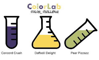
Color Lab Challenge 47

We are all about patriotic colors this week at the ColorLab!
As soon as I saw this color challenge I knew that I was going to make some kind of July 4th card.  I poked around blogland and eventually, after much deliberation, decided that the Sketchbook Saturday sketch would be a good fit for what I had in mind.


And here's my version of my patriotic version of this sketch challenge.  I'll admit that when I first saw this sketch, I was a little unsure about how I wanted to proceed.  But once I decided to combine it with the ColorLab challenge it was like the light dawned and it all came together very quickly.

I know it doesn't seem so in the photo, but I really did use Not Quite Navy here.  All of the blue that I used to stamp the stars is Not Quite Navy.  I wish it showed up better!

Thanks for stopping by today and I hope you have a chance to pop on over to the ColorLab, check out the inspiration from the design team, and join our challenge this week.  We'd love to see what you do!

Tuesday, June 28, 2011

UDI42 and Cards & Things 85

From Erna, I've discovered a new challenge website, Cards & Things.  I'm a challenge junkie, so today I've combined their latest sketch challenge with the color challenge at Utah Divas International.


I actually found this color challenge a little challenging!  I suppose that's the point, but sometimes I wish I didn't have to think so hard about how I wanted my card to end up!  I wanted a "hello" card, but ended up with a thank you card, because I didn't have a stamp that said "hello."

Obviously, I am going stamping shopping soon in order to rectify my lack of a "hello" stamp.  I still can't believe I don't have that sentiment, or something like it.  Unthinkable!  But fortunately, "thank you" is always a sentiment that I have no trouble using.  It seems like I've always got some reason to thank someone for something!

Thanks for stopping by today!

Monday, June 27, 2011

This Was Supposed To Be a Wedding Card

I've been neglecting my duties lately.  I've got my nephew's wedding on July 17th and my cousin's wedding on July 31st, and I haven't made a card for either one.  Oh the shame!  But today I took a look at the color challenge at Picture Perfect Creations and thought it would be perfect for one of those cards.

I know at first glance it may seem a little non-traditional for a wedding, but the bride has chosen red for her color and I thought that with a lot of white space and a little Basic Gray thrown in for good measure I could make something really nice.  I had seen a wedding card on Splitcoast that I absolutely loved and I intended to make my own version of it.  Then I saw the latest MOJO sketch challenge and saw a match made in heaven!
So I set to work and after about 15 minutes I realized that the layers I created were ALL WRONG!  It seems I was paying more attention to the card on Splitcoast than on the acutal sketch.  As a result, the sizes were all off and I couldn't possibly re-do what I had started to fit the sketch.  So I put what I was working on aside (I actually like what I've done and I'll finish it later) and put this little number together.

Even though my little flourish goes up when it should go down, I think it fits the sketch better than my first attempt!  And I must be feeling a little nostalgic for some of the retiring sets because I've used two here:  Fast & Fabulous and Priceless.  I've got one in my stash to keep and one in my eBay pile.  Time will tell if the one I intend to keep will actually see some ink in the future.  I hope it does!

Thanks for stopping by!

Sunday, June 26, 2011

Stamping 411 Sketch Challenge 209

Once the weather turns summery I always have a hard time bringing myself to stay inside and spend some quality time in my stamp room.  I like to be outside with the sun on my face and there always seems to be a weed or two, or a million, that need pulling up!  So today after doing some yardwork outside, I found that I had time to wander inside and make a card for the Stamping 411 sketch challenge.

I love a sketch that has big, bold geometric designs like this.  I decided to pair it with the Utah Divas International color challenge to use Early Espresso, Rose Red, Crumb Cake and Pretty in Pink.

I'm not sure why, but when I see these particular colors together I want to do a little distressing.  So I very lightly distressed the edges of all the layers including the round ones with some Early Espresso.  I used the sentiment from the soon to be retired Simple Friendship stamp set.  This is one of the sets that I consider to be a keeper because the butterly stamp included in the set is absolutely gorgeous and there's no way I'm giving it up!
Thanks for stopping by!

Saturday, June 25, 2011

Color Throwdown 147 and Deconstructed Sketch 7

This week the fine and talented ladies at the Color Throwdown brought out an old favorite of mine:  Sage Shadow.
Last year, when Stampin' Up! retired loads of colors there were a few that I couldn't bring myself to part with and Sage Shadow was one of them.  I've got my stamp pad, some cardstock and even some designer paper so it was fun to get out all three for this challenge!  I've recently come across the Deconstructed Sketch challenge and this week they've got another adorable sketch.  So, off I went to combine the two challenges.

I love square cards and I love rounded edges, so this sketch had it all going on for me!  Plus that round layer said "button" to me, and I can't say no to a button!

I just love adding small touches of black to a card.  It always seems to give it a bit of depth.  I did a little bit of rock-and-roll on my flowers.  I stamped them first in Blushing Bride then rolled the edges with Cherry Cobbler.  There are actually two flowers here in graduated sizes, but it's tough to see them layered on top of one another when they are the same color.  So I layered them with dimensionals and combined with the rock-and-roll coloring, they look quite distinct.  At least in real life they do!

Thanks for stopping by today!

Thursday, June 23, 2011

Color Lab Challenge 46

A funny thing happend when I sat down to make my card for the ColorLab challenge this week.  (Paired with the MOJO sketch challenge).


I was busy going along making my card, arranging my layers and I knew that I wanted to stamp the butterfly from the Great Friend stamp set in Bravo Burgundy.  But when I pulled out the Bravo Burgundy stamp pad (which I don't use all that often), I discovered it was nearly dry!  EEK!

I managed to pounce my lovely butterfly on the stamp pad until I got enough ink on it to create a decent impression, so all is not lost!  But I'm definitely buying a re-inker at the earliest opportunity!

So, thanks for stopping by today and I hope you'll give the ColorLab a chance.  Our design team has loads of inspiration to get you started on the right foot!

Wednesday, June 22, 2011

Color Dare 106 and FTL145

I had been contemplating the FTL sketch from last Friday for a while, but I found the sketch a little intimidating and couldn't seem to figure out how I wanted my card to look.  After poking around the blogosphere for some inspiration, I thought that the color challenge at The Color Dare was pefect for the sketch challenge, so I set to work.


After looking at this card, I still can't believe that I made it!  This is pretty far outside the realm of what I'm used to making, but I think these colors are fabulouos together.  And I love how the vellum panel doesn't cover everything completely, but gives the stamped images underneath a very soft quality.

Thanks for stopping by!

Tuesday, June 21, 2011

ColourQ 90 and Viva la Verve

I was, of course, in a very patriotic mood when I saw the colors today at the Colour Q.

So I poked around until I found a sketch I liked that would give me a good layout for all of these colors.  I settled on the Viva la Verve! sketch for week 3. 
I had high hopes for this card, but I ended up changing my mind a lot while I was putting this together, so I'm not entirely sure that I like what I ended up with! 

I think it's ok, but I spent so much time fussing over it that at this point my eyes are crossed and I have no objectivity.  I think I'll send it to my Dad and see what he has to say!

Thanks for stopping by!

Monday, June 20, 2011

Paper Players 52

I've had my new Stampin' Up! In Colors for a couple of weeks now, but I have yet to use them.  I'm not sure why I haven't but when I saw the beautiful CAS sketch this week at The Paper Players I thought it was a perfect way to showcase a couple of those colors.


Oh, I so love a good CAS design!  A while back, I made a card where I did the same sort of outline with a sentiment stamped within the lines.  I like the look.  It's rather unexpected and creates a focal point on the card that draws the eye.  For my new colors I chose Lucky Limeade and Wisteria Wonder.  And in a little ironic twist, the stamped images here are from two retired sets Central Park and Best Blossoms and the soon to be retired So Green.

Of course, I am in raptures over Lucky Limeade, because it is almost as wonderful as the retired Kiwi Kiss.  Although nothing can replace Kiwi Kiss in my affections, I'm pretty sure that Lucky Limeade and I will become very good friends in the future.  And I was very happy to see the return of a lovely, soft purple color.  I remember being surprised last year when Lavender Lace retired because there was nothing even remotely close to it to serve as a replacement.  Wisteria Wonder is quite wonderful as far as I'm concerned!  It's kind of a smoky-lavender color and I think I've got some hand towels in my bathroom that match it!

Thanks so much for stopping by and commenting.  I love to hear what you have to say!

Sunday, June 19, 2011

Color Throwdown 146 and Sketchbook Saturday 16

This week the color challenge at the Color Throwdown features one of my all-time favorites Kiwi Kiss, so I was powerless to resist that siren's call.  Fortunately I was recently able to buy a whole package of cardstock from someone who apparently didn't want it (crazy, I know), so I no longer have to be so stingy when I use it.  As you'll see from my card, I didn't go crazy with my new supply.  Baby steps, I say to myself!  Anyway, I thought the Sketchbook Saturday sketch was pretty interesting so I combined these two challenges.


I love the scallops on this sketch and the little button accents.  I think I'm a sucker for buttons!

I used the wonderful Tangerine Tango embossing powder on my flowers, rather than stamping them with ink.  I love that shiny goodness you get with embossing powder, and I was so happy to see that there are some new embossing powders in the upcoming catalog.  Fun, fun!

The weather has finally taken a turn for the better here.  I spent a very happy weekend puttering around my garden planting flowers and enjoying the fabulous weather.  I even spent some time sitting on my patio getting some sun.  Unfortunately, I neglected to turn my chaise lounge so that  I was facing the sun directly, so as a result I've got some nice summer color on one side of my face!  Next weekend I've got to remember to give equal treatment to the other side!

Thanks for stopping by!

Saturday, June 18, 2011

PPA98 and Inkspirations 74

When I saw the color challenge this week at Inkspirations, I knew immediately that I wanted to participate.

Ooh La La!  What a fabulous color combo.  And the inspiration from the design team was luscious.  I couldn't wait to get started and I thought it would be a good idea to pair this with the sketch challenge at Pals Paper Arts.

My mother's birthday is Sunday and I had a card already made for the occasion.  But I liked this color/sketch combo enough to try my hand at another birthday card to see if I could make something that I liked even better.
Although, I really like this card I'm not sure my mother will.  She's a little traditional when it comes to colors and styles, so I'm not sure she'll appreciate an eclectic color combo like this.  I think I'll sleep on it, and decide in the morning!

Thanks for stopping by!

Friday, June 17, 2011

Color Dare 105 and Unscripted Sketches 110

I decided to try my hand at a new (to me) sketch challenge called Unscripted Sketches.  I thought it had a very nice CAS layout.
And I thought that it would be a nice layout for this weeks Color Dare challenge to use Elegant Eggplant, Blushing Bride, Pear Pizzazz, and Sahara Sand. 
Elegant Eggplant is not a color that I use very often, but after using it here, I'm coming to appreciate it.  And look how great it looks with these other colors!  I even managed to use some brads that are a very deep purple (they look black in the photo, but trust me they are as eggplant as they can get)!

Thanks for stopping by today!

Thursday, June 16, 2011

Color Lab Challenge 45

This week the color challenge at the ColorLab is divine!

There's been a lot of Melon Mambo and Daffodil Delight going around lately and I love it!  It's no secret that I mostly favor earthy colors, but I LOVE Melon Mambo and it looks fabulous with Daffodil Delight and Tempting Turquoise.  In order to do this fabby challenge justice, I searched around the blogosphere until I found a sketch that I thought would be perfect for it.  I found it in the Verve challenge forum on Splitcoast.

I liked the clean and simple layout and that nice bit of white space around the edges, which I thought would nicely show off these bright colors.

I've been on a butterfly kick lately.  (When I'm not making flowers with the faux-mother-of-pearl technique, that is).  There's just something really lovely about them.  I once went to a butterfly conservatory in Canada and it was the most wonderful experience.  There were all these beautiful butterflies flying around you and you really got to observe them up close.  They are amazing creatures and I really enjoy putting them on my cards!

Thanks for stopping by today and I hope you'll venture over to the ColorLab and try out our fabulous challenge this week.  The design team has some great stuff to inspire you!

Wednesday, June 15, 2011

MOJO195 and Paper Players 51

I feel like I'm so behind on my stamping!  I've been so busy lately I haven't had time to fit in all the challenges that I'd like to, but today I managed to squeeze in the latest MOJO sketch along with The Paper Players color challenge.

What a delightful color combo!  It's especially nice to see bright and cheery colors like these because the last few days here have been kind of dull and dreary.  The sun came out today, which was a welcome change.

I wish I had stamped a little more whispy leaves because I think it needs a little more "something."  But it will have to do.  And I can't go back and stamp more, because I've got to watch the last game of the Stanley Cup finals.  My hometown team, the Boston Bruins, are trying to win their first Stanley Cup in I don't know how many years, and it's my duty to root them on!

Go Bruins!

Monday, June 13, 2011

SSSC121 and Color Dare 104

This week the color challenge at The Color Dare is very unusual.  The challenge was to use Not Quite Navy, Baja Breeze and Cajun Craze.  I had to think long and hard about this one, and I'm still not sure about what I came up with.  I decided on the Sweet Sunday sketch for my layout.

Once again, I did quite a bit of waffling about what I wanted my stamped image to be.  At first I was going to use one of the animals from the Fox & Friends stamp set, but that would have made the card a little kid-friendly and I just don't have any kid-friendly sentiments.  So, I went the butterfly route.


I think the circle is too big and would have looked quite a bit better if I had some Cajun Craze dp.  Despite all the things I don't like about this card, I do think the colors are really great together.  And I took a little liberty with the ribbon.  It's actually some left-over Dusty Durango, but the color is really close to Cajun Craze.

Thanks for stopping by!

Sunday, June 12, 2011

Sketchbook Saturday 15 and Creative Sketches 36

I'm kind of new to the Creative Sketches challenge blog but I liked these colors and thought I'd give their latest challenge a try.

With colors like these I should really use the opportunity to get a head start on my Christmas cards, but I ended up going in a different direction.  I paired the colors with the cute square Sketchbook Saturday sketch.
I love making square cards, I just wish that the post office didn't charge extra postage when you mail something square.  I don't really know what the point of that is, but I usually make cards like these 4 1/4 inches so they fit in an A2 envelope.  And that size is super cute to boot!

I know that you're shocked to see these faux-mother-of-pearl flowers, but I can't seem to help myself.  I'm fast dwindling my supply of glossy card stock because I keep making these, too!  I actually end up wasting a bit of the cardstock, because it's very slippery when you try to stamp on it with an inked-up stamp.  You have to be very careful that the stamp doesn't slide around and leave a bad impression.  That's the voice of experience there!

The weather here this weekend has been absolutely terrible.  We went from sunny, 90+ degree weather a few short days ago to wet, soggy 50-degree weather.  It's been a good opportunity to stay in the house and get some cleaning done, but I've had enough.  Why is it that we get all the good weather during the week when I'm at work and can't enjoy it and the lousy weather comes when I'm home on the weekend?  Grrrrr!

Thanks for stopping by today!

Friday, June 10, 2011

Stamping 411 Sketch Challenge 207

I've made a few graduation cards lately, but none of them were exactly what I was looking for when I thought about the card I wanted to give my nephew (who graduated from high school last week).  I had been kicking around some ideas in my head, but hadn't setlled on one.  Then tonight I looked at the Stamping 411 sketch challenge and I thought that it would be absolultely perfect for what I {thought} I had in mind.

And for (what I think) is the first time ever, I have flipped a sketch!  This is big for me.  I'm not usually a rule breaker!  If I see a sketch in landscape format, I dutifully make a card in landscape format.  But today I really wanted to use this sketch, only I wanted they layout to be portrait.  So, with apologies to the folks at Stampin 411, I present my (slightly altered) card.

My nephew has graduated from my old alma mater, and our school colors are orange and black.  So, of course, I made a card using those colors.   Although Pumpkin Pie would probably be a better choice for the orange, I really wanted to use the designer paper that looked sort of like notebook paper and that only came in Peach Parfait.  I stamped the "congratulations" from the Go Graduate stamp set, and followed it up with some phrases from the Happy Grad stamp.

He'll be off to Boston College in the fall to begin a whole new chapter in his life. I can hardly believe that he's old enough to be on his own, but there you have it.  I'm sure he'll be just fine, even if he does leave behind a weepy aunt!

Thanks for stopping by!

Thursday, June 9, 2011

Color Lab Challenge 44

Thursday is, of course, ColorLab challenge day and I've got to say that this color challenge totally rocks!

Whenever I see a deep color like Concord Crush paired with a bright color like Daffoldil Light I think that it's a match made in heaven. So today I took this fabulous color challenge and paired it with the Stamping 411 sketch challenge.
And as you'll see, I have not quite gotten over my obsession with the faux mother-of-pearl technique.

My only regret with this card is that I didn't twine some crochet floss or baker's twine around the Concord Crush layer.  I think it would have softened up the card a bit.

Thanks for stopping by today and I hope you have time to check out the ColorLab.  The design team has some fabulous inspiration for you and we'd love to see what you create!

Wednesday, June 8, 2011

PPC61 with some French Foliage

As soon as I saw the color challenge this week at Picture Perfect Creations, I immediately thought of my much-loved French Foliage stamp set.

I know it's practically summer and it's about 100-degrees here, but I can't help but make an autumn-inspired card when I see colors like these!

I went to "the binder" for my layout for this card.  This time it's the FTL43 sketch from 2009!  I'm not sure it shows in the photo, but I used the rock-n-roll technique on my leaves here.  I stamped the leaves in Cajun Craze then rolled the edges with Always Artichoke. It's a subtle effect, but in real life it looks quite nice.

Thanks for stopping by and I hope you have time to stamp today!