Showing posts with label Color Lab. Show all posts

Saturday, October 15, 2011

Color Lab Challenge 55

This month at the ColorLab we've got an interesting color combo for you!

And we've also got a terrific guest designer joining us!  Paula Stewart of Sweet Shoppe Cards is joining us this month and she's got this great clean stamping style that I just know you're going to love.

I mixed a little bit of the old and the new with my card.  The designer paper I used is from the Beyond the Garden pack, the sentiment is from Just Believe, and the flower is stamped in my brand new Creative Elements stamp set.  I can see a lot of potential with that stamp!  May layout is the sketch challenge courtesy of Cards & Things.

Now it's your turn to visit the ColorLab design team and load up on the inspiration you will find there.  Then hop on over to the ColorLab and use the linky tool to show us your creation!

Juanita Golson
Jennifer Weide
Paula Stewart - our guest designer this month

Thanks for stopping by!

Monday, August 15, 2011

Color Lab Challenge 53

Today is the first day of a new format at the ColorLab color challenge.  We usually begin our challenges weekly on Thursday, but we're switching to a monthly challenge on the 15th of each month.  Hopefully, this will give everyone more time to participate!  So let's get on with today's challenge.


For my layout I chose the FTL153 sketch (which for this challenge has teamed up with CAS-ual Fridays for double the fun)! 


First, I stamped the scripted image from the French Foliage stamp set once in Soft Suede, then again in More Mustard.  Then I stamped one of the floral images from the Simply Soft hostess set in Pear Pizzazz then followed that with some Pool Party to fill in the colors of the flower.

So go on over to the ColorLab and check out the samples from the design team to get your creative juices flowing.  Then create something!  We'd love to see what you do!

Thursday, August 4, 2011

Color Lab Challenge 52

Today marks the end of the new color palooza at the ColorLab.  In case you missed it, for the past five weeks the color challenge at the ColorLab featured one of the fabulous new In Colors from Stampin' Up!

Today, of course, features the delightful Pool Party.  And when you pair it with So Saffron and Not Quite Nafvy, it becomes spectacular!

 
The layout I used is from the fabulous sketch of Nance from the Paper Players latest challenge.  I thought long and hard about the shape of the focal layer before I settled on this shape from a Nesties die.  Although I wasn't at all sure that I made the right choice initally, I've decided that it looks pretty good!  I love when what I've envisioned in my mind mirrors what I've created with my hands.  Sometimes that's not always the case!

Well, thanks for stopping by and I hope you have time to pop on over to the ColorLab, check out the inspiration from the design team and then show us what you've got!  We'd love to see what you do!

Thursday, July 21, 2011

Color Lab Challenge 50

Welcome to week three of the ColorLab New Color Palooza!

This week features the awesome Lucky Limeade, which may replace Kiwi Kiss in my affections.  The jury is still out in that regard, but so far I like this color very much.

This is not a color combo that I would ordinarily put together, but as usual once I figured out my layout and the stamps I wanted to use, the color palette made perfect sense to me!  I used one of the stamps from Pocket Silouettes which I colored with my Riding Hood Red and Lucky Limeade markers.  The Perfect Plum layer is actually some Halloween paper from a few years ago!  It wasn't very Halloween-y  so I thought it would be a perfect accent layer.  I love doing that!

The layout is a bit unusual, but I thought it was pretty interesting so I thought I'd see what I came up with if I used it.  It's from a Taylored Expressions sketch challenge that I found in my "binder o-sketches."  It has no number and I couldn't find a link to it on the blog, so you'll have to believe me when I say that's the one!  I remained true to the sketch except for a ribbon that was supposed to go between the Lucky Limeade and Perfect Plum layers.

So I hope you have some time to hop on over to the ColorLab and check out the other samples from the design team.  I'm sure you'll find lots of inspiration to get you started.  And don't worry if you don't have the exact colors.  You can use whatever you have that is close (Kiwi Kiss anyone)!

Thursday, July 14, 2011

Color Lab Challenge 49

Today is the second week at the ColorLab where we show off one of the new In Colors.  This week it is the beautiful Island Indigo.

When I first saw this color challenge I've got to admit that I was a bit stumped.  I couldn't seem to wrap my head around mixing up the Rich Razzleberry with those blue shades.  Then I put my card together and suddenly it all came together!  I've come to realize that this is one FABULOUS color combo!  Simply gorgeous!

The layout is one that I used a few weeks back and I really liked it so I figured I'd use it again.  As with the other card, I embossed the Island Indigo layer then heat embossed it with clear embossing powder.  The Baja Breeze designer paper you see is a retired one from the Walk in the Park set from many years ago.  I still have a tiny bit left so I used a scrap of it.  I really like the vertical stems on it since it went nicely with my floral accent.  I was undecided how I wanted to finish the center of my flower then I remembered that I had some Build-A-Brads in my stash.  I stamped a tiny flower in Rich Razzleberry then built my brad around it.  It makes a nice, bold accent for this flower.

Oh, and I haven't mentioned how utterly fabulous Island Indigo is.  I'm not sure I've seen a color quite like it before, but I assure you that it is SPECTACULAR!  I can't wait to use it some more.

I hope that you'll go on over to the ColorLab and check out the challenge this week.  And don't worry if you don't have the exact SU! colors for the challenge.  Just use something similar.  And be sure and check out the design team samples.  There's lots to inspire you!

P.S.  I think Blogger hates me.  This is the second week in a row that I've scheduled a post ahead of time and it hasn't posted when it's supposed to.  Grrrrrrr!

Thursday, June 30, 2011

Color Lab Challenge 47

We are all about patriotic colors this week at the ColorLab!
As soon as I saw this color challenge I knew that I was going to make some kind of July 4th card.  I poked around blogland and eventually, after much deliberation, decided that the Sketchbook Saturday sketch would be a good fit for what I had in mind.


And here's my version of my patriotic version of this sketch challenge.  I'll admit that when I first saw this sketch, I was a little unsure about how I wanted to proceed.  But once I decided to combine it with the ColorLab challenge it was like the light dawned and it all came together very quickly.

I know it doesn't seem so in the photo, but I really did use Not Quite Navy here.  All of the blue that I used to stamp the stars is Not Quite Navy.  I wish it showed up better!

Thanks for stopping by today and I hope you have a chance to pop on over to the ColorLab, check out the inspiration from the design team, and join our challenge this week.  We'd love to see what you do!

Thursday, June 23, 2011

Color Lab Challenge 46

A funny thing happend when I sat down to make my card for the ColorLab challenge this week.  (Paired with the MOJO sketch challenge).


I was busy going along making my card, arranging my layers and I knew that I wanted to stamp the butterfly from the Great Friend stamp set in Bravo Burgundy.  But when I pulled out the Bravo Burgundy stamp pad (which I don't use all that often), I discovered it was nearly dry!  EEK!

I managed to pounce my lovely butterfly on the stamp pad until I got enough ink on it to create a decent impression, so all is not lost!  But I'm definitely buying a re-inker at the earliest opportunity!

So, thanks for stopping by today and I hope you'll give the ColorLab a chance.  Our design team has loads of inspiration to get you started on the right foot!

Thursday, June 16, 2011

Color Lab Challenge 45

This week the color challenge at the ColorLab is divine!

There's been a lot of Melon Mambo and Daffodil Delight going around lately and I love it!  It's no secret that I mostly favor earthy colors, but I LOVE Melon Mambo and it looks fabulous with Daffodil Delight and Tempting Turquoise.  In order to do this fabby challenge justice, I searched around the blogosphere until I found a sketch that I thought would be perfect for it.  I found it in the Verve challenge forum on Splitcoast.

I liked the clean and simple layout and that nice bit of white space around the edges, which I thought would nicely show off these bright colors.

I've been on a butterfly kick lately.  (When I'm not making flowers with the faux-mother-of-pearl technique, that is).  There's just something really lovely about them.  I once went to a butterfly conservatory in Canada and it was the most wonderful experience.  There were all these beautiful butterflies flying around you and you really got to observe them up close.  They are amazing creatures and I really enjoy putting them on my cards!

Thanks for stopping by today and I hope you'll venture over to the ColorLab and try out our fabulous challenge this week.  The design team has some great stuff to inspire you!

Thursday, June 9, 2011

Color Lab Challenge 44

Thursday is, of course, ColorLab challenge day and I've got to say that this color challenge totally rocks!

Whenever I see a deep color like Concord Crush paired with a bright color like Daffoldil Light I think that it's a match made in heaven. So today I took this fabulous color challenge and paired it with the Stamping 411 sketch challenge.
And as you'll see, I have not quite gotten over my obsession with the faux mother-of-pearl technique.

My only regret with this card is that I didn't twine some crochet floss or baker's twine around the Concord Crush layer.  I think it would have softened up the card a bit.

Thanks for stopping by today and I hope you have time to check out the ColorLab.  The design team has some fabulous inspiration for you and we'd love to see what you create!

Sunday, May 29, 2011

Less Is More 17 and Color Dare 102

I mostly consider myself to be a Clean and Simple girl.  I very rarely make the kind of card that has so many layers and embellishments that it won't fit into an envelope.  But today, I think I may have made the most Clean and Simple card that I have ever made.  And it's all because of the Less is More and Color Dare challenges.

This is the sketch challenge from Less is More.  We get to choose which of the five squares we want to put the focal point of our card.  The rest is white space.  I was intrigued right away and the color challenge of So Saffron, Concord Crush and a neutral at the Color Dare seemed the perfect way to make this uber-CAS card. 
As you can see by my little flower, I have not got over my obsession with the faux mother-of-pearl technique so I sponged a little So Saffron and then sponged some Concord Crush onto my already prepared glossy cardstock.  Then I tried something a little different.  Instead of stamping the floral image in Black Stazon, I stamped the image in Versarmark then went over it with white embossing powder.  I wasn't sure if the white outlined stamp was going to show up or be lost against the white background of the card base, but it does and I'm pretty pleased at how it turned out.

Thanks for stopping by today!

Thursday, May 26, 2011

Color Lab Challenge 42

This week the colors for the challenge at the ColorLab are brought to you by yours truly! 

A while back Julie asked the ColorLab design team to come up with colors for future challenges.  So as I pondered what colors I would choose, I happened to glance at the curtains in my stamp room.  And I realized that the reason why I chose the fabric for these curtains in the first place was because I loved the colors so much.  The logical conclusion that I reached was that these colors would make a fabby color challenge too!

What can I say?  I'm a Crumb Cake girl at heart, and when you pair it with the Soft Suede and Baja Breeze, I'm in heaven.  Good thing my eye settled on those curtains, or else I may never have decided that these colors would make such a sweet card!  Of course, half of the battle when making a card is an appropriate layout to highlight the colors and I chose my layout for this card from the latest MOJO sketch.  I think the two challenges go great together!

Thanks for stopping by and don't forget to pop on over to the ColorLab, check out the inspiration from the rest of the design team, then make something of your own.  We'd love to see what you do!

Friday, May 20, 2011

PPC Sketch Challenge and Color Dare 101

For my card today, I went with the sketch challenge at Picture Perfect Creations and the color challenge at the Color Dare:  Old Olive, Regal Rose, and Early Espresso.

It seems like it's been ages since I've made a card with Early Espresso.  And this color challenge gave me an excuse to use it and the Early Espresso bakers' twine.  A while ago, I bought the twine but hadn't used it.  I use crochet thread quite a bit on my cards, so the other day I made a card and used the white baker's twine instead of the crochet thread.  I really liked the weight of it and it didn't have the tendency to twist around itself like the crochet thread does. 

Since I liked it so much, I thought it would be worth it to buy one of those big cones of baker's twine that you find at bakery supply stores.  I found one selling white twine and the price was ok considering the amount of twine I was buying.   Well, I got it the other day in the mail.  The bad news is that it's not really white.  It's more of a natural, unbleached color but that's ok because I can still use it.  What I was shocked to see is just how much twine I got.  The total amount of the cone is 3,024 YARDS!  That's right YARDS, not FEET!  There's enough twine on this thing to wrap me up mummy style!  In fact, that may be what I do with it because there's no way I'll be able to use that much twine in my lifetime!  Live and learn, I say!

Thanks for stopping by today and I hope you have time to stamp today!

Thursday, May 19, 2011

Color Lab Challenge 41

I had a feeling that when I tried out the faux mother of pearl technique that I was going to want to do it again soon!  And this week's ColorLab challenge had me thinking that I should try it right away!

I had some designer paper from the Lap of Luxury paper pack, which took care of the Blushing Bride and the Concord Crush. Now I just needed to work on the Pear Pizzazz and Perfect Plum.


I've got to admit, I had a hard time working these colors.  But I'm nothing, if not persistent!  The card base is Concord Crush and it's layered with a couple of different papers from the Lap of Luxury designer series paper along with some Blushing Bride and Concord Crush.  When I had those parts settled, I decided to use the mother or pearl technique on my floral accents, coloring the flowers with Perfect Plum and Blushing Bride, then I added a Pear Pizzazz leafy bit.  Once I had it all together, I realized that these colors are gorgeous together!

My layout for this card came from the Sketchbook Saturday sketch challenge.   Every week, Chupa encourages me to think outside my comfort zone with her sketches.  That's what this card-making journey is all about, right?

So I hope you take some time to visit us at the ColorLab and make a card using these colors.  And don't forget to check out the design team for some inspiration!

Friday, May 13, 2011

Color Lab Challenge 40

ETA:  Well, it appears that Blogger has fixed whatever was wrong, so I can finally get this post up!

I'm so glad that I've had a chance to get some stamping in this week.  I don't know about you, but sometimes I think it's therapy!  And if I don't have a chance to get my fingers all inky, I get cranky!  I will spare you all the cranky details and share a creation with you instead.  Today, of course, is challenge day over at the ColorLab.  I hope you have time to join us this week as we create projects using these great colors.

I think I'm in heaven with these colors!  I know I don't use it very often, but Not Quite Navy is one fabulous color.  And look how wonderful these colors all look together.  I couldn't wait to get going using them.  I decided that the MOJO sketch from last week, would be a good way to show them off.
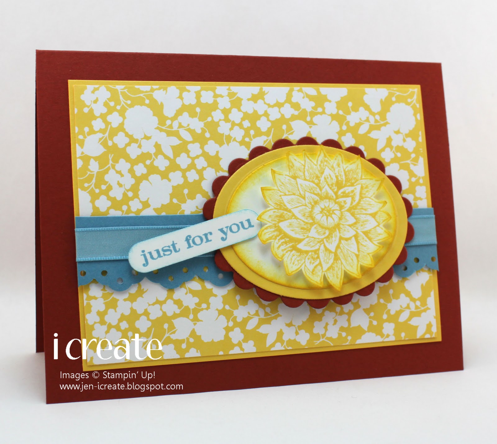
I really liked the scalloped edge on the larger layer and that cool oval element with the strings coming out of it.  There was a lot going on with this sketch, but I think that's the perfect way to highlight a color challenge that has more than three colors.

Once I put this card all together, I wasn't sure that I liked it.  Even now as I'm typing this, I'm not sure about it.  The Baja Breeze and Not Quite Navy look crazy-good together, but I'm not sure that I've shown off the Pear Pizzazz and Rose Red to their best advantage.  I hate when I begin to second-guess myself about a card I've created.  I'm pretty sure it looks ok, but there's always that part of me that thinks that I should have gone back to the drawing board.  I'm sure you know what I'm talking about and I'm also pretty sure that I'm too hard on myself, but there you have it. 

Anyway I'm sure that if you check out the ColorLab challenge this week and visit the design team, you will find ample inspiration to create something of your own.  I hope you'll join us this week!

Thursday, April 28, 2011

Color Lab Challenge 39

I'm not sure where my brain has been this week!  It's definitely not here with me.  Thursday is, of course, ColorLab challenge day and I usually have my post scheduled in advance to post when I'm still sleeping!  But for some reason this week, I completely forgot about it.  But better late than never!

What fabulous colors Julie has for the challenge this week.  And here's my card:

I had some pumpkin pie designer paper from the retired Island Oasis paper pack which I thought would make a cute background for my card base.  And I think it's been a few days since I've used my Fabulous Florets stamp set.  I'm pretty sure I was suffering from withdrawal, so I figured the only cure was to take it out and stamp with it!

Thanks for stopping by today.  And don't forget to head on over to the ColorLab and check out this color challenge as well as the inspiration from the design team.  We'd love to see what you do!

Thursday, April 21, 2011

Color Lab Challenge 38

The colors for the challenge this week at the ColorLab are so sweet!

I mananged to take a one-day vacation from the new Fabulous Florets stamp set, but with my card today it's back!
I'm lucky that I still have quite a bit of designer paper from the Sweet Pea paper pack which includes this fabulous background paper.  Then I dug around in my stash and found some Certainly Celery buttons.  And they're so cute because they're square!

I've been on vacation this week and as luck would have it, the weather has been kind of lousy.  Why is it that the sun only seems to shine when I'm at work?  I'm sure that next week, when I'm hard at work tapping at my keyboard it will be 70-degrees and sunny!

Thanks for stopping by.  And don't forget to head on over to the ColorLab and try out this color challenge.  It's bright and sunny, even if the weather where you are isn't!!

Thursday, April 14, 2011

Color Lab Challenge 37

Thursday is ColorLab challenge day!  I hope you can join us to create something with these fabulous colors!

For my card, I decided to do a birthday card.  I always seem to run out of those!  Rose Red and Regal Rose seem to want to inspire me to do some kind of floral card, but I make tons of those already so I really wanted to challenge myself to do something a little different.  I thought the latest MOJO sketch was quite interesting so that's what I used for my layout.

I ended up combining some designer paper from the Sweet Pea designer pack and a retired 6x6 pack called Patterns Pack II to make a birthday card.  The Always Artichoke provided some nice contrast to the layers and I'm pretty pleased with how this turned out!

Thanks for stopping by and don't forget to pop on over to the ColorLab and check out the challenge this week.  The design team has some great inspiration for you!

Thursday, April 7, 2011

Color Lab 36

The more I use Poppy Parade, the more I like it, so I was happy to see it in this week's ColorLab challenge.

It's a very interesting red.  It's bright without being too over-powering and has a deep color well suited to practically all of my floral stamps.  I think it looks particularly good with the stamp set I chose here, Greenhouse Garden.

And look how great it looks with Early Expresso! 

The only thing I don't like here is the flower in the middle that seems to be floating around like an astronaut in space!  I don't know what I was thinking...Oh well.  Too late to change it now.  Even still, I do love the flowers with the Early Espresso accents in the center.

Thanks for stopping by and don't forget to head on over to the ColorLab.  The design team has some great inspiration for you and I hope you have a chance to play along with us.

Thursday, March 31, 2011

Color Lab Challenge 35

Elegant Eggplant is not a color that I have used very often, but this week the color challenge at the ColorLab pairs it with Old Olive and Chocolate Chip.  Nothing like a couple of great colors to get the creative juices flowing and entice me to try a something new.

I started my card by following the MOJO sketch, which, on the last Monday of the month, is always a choice between a round or square card.
I love round cards, and it's been a while since I made one, so I tried my hand at it again.  What I ended up with is a faithful version of the color challenge and a modified version of the sketch!  I found that my scallop circle was a little small and seemed over-powered by a couple of elements of the sketch.  So I switched the ribbon at the top for some linen twin, and completely left off  the long thin panel that would be next to the button. 

But despite these changes I really like how this card turned out.  The colors are so rich you can't help but like them.  And I can always add a heartfelt sentiment on the inside of the card later. 

Thanks for stopping by and don't forget to stop by the Color Lab, check out the fabulous colors and inspiration from the Design Team and create something.  We'd love to see what you do!

Thursday, March 24, 2011

Color Lab Challenge 34

It's Thursday and time for a ColorLab challenge!  Our colors this week are Daffodil Delight, Pear Pizzazz, Chocolate Chip and Whisper White.


What a fabulous color combo!!  I think I had forgotten how pretty Chocolate Chip was, so I reminded myself by using some of my retired Sweet Pea designer paper for the big Chocolate Chip panel here.  For my layout, I used the Viva La Verve March Week 3 sketch challenge which suggested quite a bit of stitching.  Since I love my Janome Sew Mini, I got it out of the closet and did a little stitching to add some visual interest.

I had this lovely satin ribbon in my stash (not sure where it came from), but to my delight it matches Pear Pizzazz almost exactly.  I love when that happens!  And since these colors are a pefect match for a big sunflower, that is what I decided to do.  I colored directly on my Inspired by Nature stamp, carefully cut it out and popped it up on my card with dimensionals.

Thanks for stopping by and don't forget to pop on over to the ColorLab.  The design team has some fabulous creations to inspire you.  So, get your stamps out and start creating.  We'd love to see what you do!