Thursday, October 30, 2014

HYCCT1430 Spread Your Wings and Fly

Today my friend Jen Timko is hosting the Hope You Can Cling To challenge at Splitcoast Stampers.  A few weeks ago she asked and along with some other talented stampers to make a card for the challenge.  The theme is Hope Soars inspired by this quote:  "When everything seems to be going against you, remember that the airplane takes off against the wind, not with it..." - Henry Ford.

Now, for those of you who don't know, Jen is a pilot so I knew I just had to use an airplane on my card.  Especially with that quote!


When she first asked me to join in her challenge I started searching my favorite stamp companies for an airplane image then I remembered this adorable bunny image and bought the digi.  I colored it up and added this hopeful sentiment against some rolling hills.  All the stars aligned with this card because I also had this cloud-filled patterned paper too!

Are you playing along with us?  If not, you're missing out on the chance to lift the spirits of women battling breast cancer at MD Anderson and also on more than $5,000 in prizes from your favorite crafty companies.  So what are you waiting for?  Get to stamping!

Thanks for stopping by!

Supplies:
Stamps:  Chatterbox (The Alley Way Stamps); Rabbit Traveler Airplane digi (Zlatoena Designs)
Paper:  Classic White (Flourishes); Bermuda Bay, Welcome Neighbor DSP (SU); X-Press It Bending Card
Ink:  Onyx Black (Versafine); Copics
Accessories:  Snow Drift die (My Favorite Things)


Wednesday, October 29, 2014

Freshly Made Sketches 160

Happy Wednesday!  It's time for a brand new sketch from Freshly Made Sketches.  This week our sketch is designed by Rita and I'm pretty sure you're going to love it!  It's got a big ol' banner on it and I love banners!  This is also my last week guesting over at Colour Me...!  They really put together some gorgeous color combos and this week there are two palettes to choose from.


I chose to use the second color combo.  It's got Chocolate Chip in it and I really love that color.  It's been ages since I've used it so I dove right in to my supply of cardstock and even used a little ink too.  I love how it looks with Lost Lagoon and although pink isn't really my thing, I think both colors look pretty with the Blushing Bride.

The little butterfly seems a little weird on my card considering it's fall and butterflies seem better suited for spring and summer.  But I love using them on my cards and these colors reminded me of spring so there you go.  They're kind of timeless, don't you think?

Thanks for stopping by here and don't forget to check out the challenges at Freshly Made Sketches and Colour Me...!  Both design teams have totally rocked their cards!

Supplies:
Stamps:  So 80s (WPlus9); Many Thanks (Simon Says Stamp)
Paper:  Classic White (Flourishes); Chocolate Chip, Lost Lagoon, Blushing Bride, Whisper White (SU)
Ink:  Blushing Bride, Chocolate Chip (SU)
Accessories:  Horizontal Stitched Strips, Pierced Fishtail Flag STAX, Pierced Circle STAX (My Favorite Things); Chrissy Butterfly die, Leanna Butterfly die (Simon Says Stamp)

Tuesday, October 28, 2014

colourQ 265

Halloween is fast approaching and I figured I had one last Halloween card in me.  Lucky for me the new palette up at colourQ fit right into my plans.  The colors are based on these custom made designs.  How cute are they!  As I thought about a design for my card I decided that I wanted to use my favorite Halloween set and that the design of the Pals Paper Arts sketch would allow me to show off the focal image of my idea perfectly.


I spent an inordinate amount of time trying to figure out the best way to cut those angled layers without wasting a lot of cardstock.  What I ended up wasting was a whole lot of time.  I should have just cut some rectangles, layered them on the card base and trimmed the excess off the edges.

This card features a Herman Munster like dude (or Frankenstein, if you're picky) and he's from my beloved Best Fiends stamp set.  I love his runway pose as he shows off his trick-or-treat bag.

So will you create a crafty Halloween card with these pretty colourQ colors or something else entirely?  I'd love to see you in the gallery!  In order to spark your creativity, our design team has got some beauties to share with you so be sure to check them out!

Thanks for stopping by!

Supplies:
Stamps:  Best Fiends (SU)
Paper:  Basic Black, Tangerine Tango, Concord Crush, Howlstooth and Scaring Bone (SU); X-Press It Blending Card
Ink:  Black Licorice (My Favorite Things); Copics
Accessories:  Frightful Enamel Dots (My Mind's Eye); Enamel Dots (Studio Calico)


Wednesday, October 22, 2014

Freshly Made Sketches 159 and Colour Me...! 43

Happy Wednesday everyone!  Today we've got a new sketch at Freshly Made Sketches and this week the sketch is brought to you by little ol' me!  I hope you find lots of inspiration in it!

My card incorporates the palette at Colour Me...! where I am the guest designer this month.  I've never been a big fan of Crisp Cantaloupe but I've got to say that I've got a new appreciation for it now.  It seems to go with just about everything!


I recently got this new stamp set and I've been dying to ink it up.  The big square layer on the sketch was perfect for showing off the flowers stamped in these beautiful colors.   It was a little tricky at first figuring out how the layers of these stamps went together but I have to admit it was fun figuring it out and seeing how the flowers gained depth each time I added a layer.

The ladies at Freshly Made Sketches and Colour Me...! have created some beautiful cards for you to see so be sure to check them out.  We'd love to have you join us this week!

Thanks for stopping by!

Supplies:
Stamps:  Painted Flowers (Altenew); Celebration of Thanks (Verve)
Paper:  Crisp Cantaloupe, Blackberry Bliss, Whisper White (SU)
Ink:  Soft Cantaloupe (Hero Arts); Calypso Coral, Elegant Eggplant (SU); True Black (Papertrey Ink)
Accessories:  Pierced Square STAX (My Favorite Things); Banner Trio die (Wplus9); Antique Brad (SU); white seam binding ribbon

Tuesday, October 21, 2014

colourQ 264

Hello there!  Today is the reveal of a new color palette at colourQ and it just so happens that the colors, inspired by this table runner, are perfect if you are in the mood for a Halloween card or, as in my case, you would like to try something new.

The challenge this week at Friday Mashup is to try something that I'd never heard of called the Galaxy Technique.  You basically create a card where the background looks like some of the views you've probably seen from the Hubble space telescope.  They've got a couple of links to video tutorials on the challenge post - one using watercolors and one using Distress Paints.  And both are very cool.


This is actually the second version I attempted using this technique.  The first one I made was using watercolor paints and since me and watercoloring are barely on speaking terms you can only imagine the hot mess that followed.  For my second attempt I wanted to try something more like the Distress Paint version even though I didn't have any paint, Distress or otherwise.

I started out by tapping some Distress Ink on my craft sheet in the orange, green and purple colors.  I misted them with water then smooshed my cardstock in the mess I created.  Then I took some black dye ink and tried the same thing.  The black didn't look so good.  (Note to self, put black Distress Ink on my wish list).  Not to be deterred I dried the cardstock with my heat tool then set about sponging black ink all over it.  The darker areas you see are actually the smudgy effect of using the black dye ink misted with water so even though I thought it looked terrible when I first did it, I ended up liking how it gave my little corner of the universe some depth.

I added some little splatter stars by dipping a brush in some shimmer paint and tapping it against my finger so that it would leave splatters all over the place.  I heat embossed, in white, some bigger stars and something I like to think of as a comet tail to finish off the look.

I'm quite pleased with how it came out except for the part where I messed up and used Wisteria Wonder ink and Vintage Violet cardstock.  You've already stuck with me this long so I won't bore you with THAT story, I'll just thank you for stopping by.

ETA:  I'm also submitting this card over at City Crafter Challenge Blog where the challenge is to add a piece of sky.  Thank's LeAnne for letting me know about that!

The colourQ gang have again made some outstanding cards using these colors so please pop on over there to check them out.  We always love to see you in the gallery!

Supplies:
Stamps:  So 80s (WPlus 9); Mini Stamp Brilliant, Mini Stamp Right Now (Heidi Swapp)
Paper:  Vintage Violet, Whisper White (SU); White (Spectrum Noir)
Ink:  Crushed Olive, Spiced Marmalade, Dusty Concord (Distress Ink); Wisteria Wonder, Basic Black (SU); Versamark
Accessories:  white embossing powder


Sunday, October 19, 2014

Peace

Aside from one rainy day this past week we have had some fantastic weather here in Massachusetts.  The sun has been shining, the temperatures have been more like June than October and it's been truly wonderful.   And it's all coming to and end.  Starting today fall is back and while fall is nice, it really just means that winter is not that far behind.  Good news for some, but bad news for a snow hater like me.

One thing I do like about this time of year is making Christmas cards.  I've been meaning to make a card for the Festive Friday challenge and finally found some time on Saturday to get in my craft room.  The Sketch Saturday provided a nice layout for my idea too.


I was inspired by the colors, the red ribbon and the greenery so I fussy cut some pine branches then added some red circles to simulate berries.  A little ribbon, a simple sentiment and I was done.  The white chairs sure give an impression of white space, so I made sure to leave lots on my card.

Well that's it for me.  Thanks for stopping by!

Supplies:
Stamps:  Fantastic Foliage (SU); Joyous Noel (Verve)
Paper:  Early Espresso, Real Red, Whisper White (SU)
Ink:  Garden Green, Early Espresso (SU)
Accessories:  Pierced Square STAX (My Favorite Things); Real Red grosgrain ribbon (SU)


Wednesday, October 15, 2014

Freshly Made Sketches 158

Half way through the work week.  Yay!  And, of course, since it's Wednesday we've got a great new sketch for you at Freshly Made Sketches.  This week Jen Timko is our hostess and as soon as I saw the sketch I loved it and I know you will too.


This is also my third week joining the talented design team at Colour Me...! and I've got to say that they have quite a knack for picking color palettes.  The Island Indigo and Soft Sky are complementary and the Crisp Cantaloupe adds such an interesting contrast.  I LOVE how these colors look together!

Don't forget to check out the inspiration from Freshly Made Sketches and Colour Me...!  The design team cards are amazing and I hope you'll join us this week!

Thanks for stopping by!

Supplies:
Stamps:  Friendly Flowers (Papertrey Ink)
Paper:  Soft Sky, Island Indigo, Crisp Cantaloupe, Island Indigo DSP, Whisper White (SU)
Ink:  Soft Sky, Island Indigo, Crisp Cantaloupe (SU)
Accessories:  Finishing Touches Edgelit (SU)


Tuesday, October 14, 2014

colourQ 263

Halloween is only a few weeks away so to get you in full swing this week at colourQ we've got some great colors inspired by this wicked door swag.


I thought the graphic sketch at Fusion was pretty cool and that I could take the circles and make them seem like full moons.  Then I just added some icky spiders - because really, all spiders are icky - and a razzleberry bat.  I just happen to have some baker's twine in my stash that I bought especially for Halloween projects and since it has the perfect colors for the challenge I wrapped it around the bottom of my vertical layer. 


The colourQ team have got some great cards to show you, as always, so pop on over there to have a look.  I hope to see you in the gallery!

Thanks for stopping by!

Supplies:
Stamps:  Bite Me, Autumn Apparitions (SU)
Paper:  Classic White (Flourishes); Basic Black, Tangerine Tango, Daffodil Delight, Whisper White, Cast-a-Spell DSP (SU)
Ink:  Daffodil Delight, Rich Razzleberry, Versamark (SU); True Black (Papertrey Ink)
Accessories:  Tangerine Tango embossing  powder; Harvest Corn twine (Maya Road)

Monday, October 13, 2014

Autumn Wishes

I was so productive yesterday.  I managed to make three cards, try a different take on some shepard's pie, go to the supermarket, watch some football and all of that in plenty of time to watch the season premier of The Walking Dead.  That's a good day I say to myself!

The first card I made was for the color challenge at The Paper Players, uses the layout at Deconstructed Sketch, the Autumn theme at As You See It and a button and sentiment for Sentimental Sundays.  Whew!


I wish the three leaves showed up a little better, but they all seem to blend together a bit.  I rock and rolled the colors on them but was having a hard time adding a little definition between them with my extra juicy Mossy Meadow ink pad.  It kept adding much more color than I wanted so I stopped trying to do it before I ruined them.  They look better in real life!

Thanks for stopping by!

Supplies:
Stamps:  French Foliage (SU); Distressed Grid (Creative Embellishments); Fall Colors (Precious Remembrance)
Paper:  Classic Ivory (Flourishes); Hello Honey, Mossy Meadow, Tangelo Twist, Very Vanilla (SU)
Ink:  Hello Honey, Tangerine Tango, Mossy Meadow (SU)
Accessories:  Candy Cane button, Always Artichoke seam binding ribbon, Decorative Dots embossing folder (SU); Pierced Square STAX (My Favorite Things)


Sunday, October 12, 2014

Brilliant!

Day one of the long weekend here found me with some extra time stamping-wise.  Usually my weekends are pretty busy with cleaning, running errands and trying to get design team cards made for the coming week.  But the prospect of an extra day off from work gave me some time to do a little leisurely stamping for no particular reason.

Not surprisingly I made another card to play along with the splatter challenge at CASology and combined it with the one layer challenge at Less is More.


I played no part in adding the splatters on this card - they came with the floral stamp.  I briefly toyed with the idea to add a few more but figured there was a good chance that I'd ruin it so I left it alone.  The flowers are stamped with Distress Ink and after I inked up the stamp I sprayed it with water to smoosh the colors around.  This isn't watercolor paper so the effect is subtle but in real life I can see some depth of color amid the flower petals.

Today I've not nothing planned but some grocery shopping, football watching and card making!  Fall is definitely in the air here and I actually turned on the heat yesterday because it was getting a bit chilly in the house.  Apparently the cats thought I should have done it sooner because as soon as the radiators got warm they were draped all over them!

Thanks for stopping by!

Supplies:
Stamps:  Poppy Field (Rubbernecker Stamps); Mini Stamp Brilliant (Heidi Swapp)
Paper:  White (Spectrum Noir)
Ink:  Jet Black (Archival); Worn Lipstick (Distress Ink); Onyx Black (Versafine)


Friday, October 10, 2014

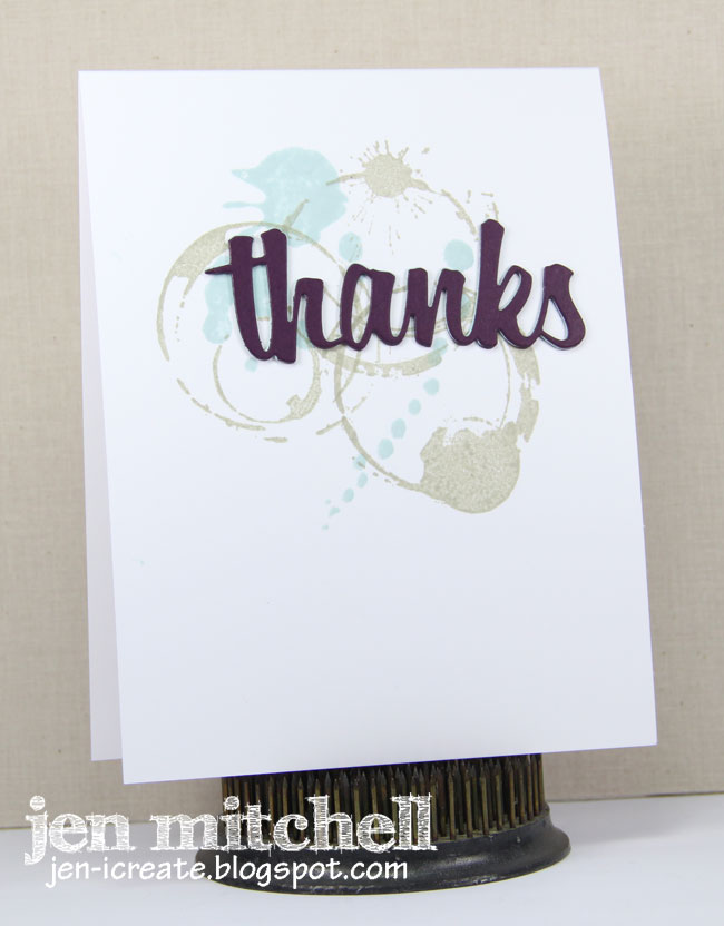
Splatters, Colors and Thanks

The cue card this week at CASology is splatter.  If ever there was a challenge with my name written all over it, this is it!  I love me some grungy splatters, that's for sure.  After seeing that I poked around some and found the gorgeous color challenge at Stampin' Royalty and decided to combine the two.


I've got some coffee splatters to go along with some ink splatters.  And a sentiment die that I cut three times and layered together.  Simple and sweet!

Thanks for stopping by!

Supplies:
Stamps:  Java Spills (Stamping Bella); Abstract Art (My Favorite Things)
Paper:  White (Spectrum Noir); Blackberry Bliss (SU)
Ink:  Sahara Sand, Soft Sky (SU)
Accessories:  Thanks Word die (Lil' Inker Designs)


Wednesday, October 8, 2014

Freshly Made Sketches 157 and Colour Me...! 41

Happy Wednesday everyone!  Time for a new sketch from Freshly Made Sketches and it's my second week guest designing at Colour Me...! so I get to show you some cool colors too!  This week Amy is our sketch hostess and we're going striking with the colors!


Isn't this sketch fantastic?  It's wide open to interpretation and the star can be substituted for any shape.  I started with a little textured layer and since the colors made me think of fall I added some leaves inked up with a little rock and roll technique.

Be sure to head on over to Freshly Made Sketches and Colour Me...! to check out the beautiful cards the respective design teams have made.  They will knock your socks off!

Thanks for stopping by!

Supplies:
Stamps:  Fall Colors (Precious Remembrance)
Paper:  Classic Ivory (Flourishes); Naturals White (Neenah); Hello Honey (SU)
Ink:  Hello Honey, Cherry Cobbler (SU)
Accessories:  Bricked embossing folder (Tim Holtz); Cherry Cobbler button (SU); baker's twine


Tuesday, October 7, 2014

colourQ 262

October is breast cancer awareness month, so it only seemed appropriate that there be color challenges to mark the event.  At colourQ we have such a challenge and the palette is inspired by this T-Shirt.


Some years ago I got this freebie stamp set from a.muse studio and it's perfect for when I need a card to send someone a positive vibe.  Like many of you, unfortunately I know one too many people who have been diagnosed with breast cancer, my own sister included.  A card is a small thing in the face of all these brave ladies go through, but I also know the power of a hand written card and the joy someone can feel just by knowing that someone is "thinking of you."

The fun layout of my card comes from retro sketches, where they are hosting a "you pick the sketch" challenge.  We get to choose from any of their past sketches and I chose #133 because I loved it when I saw it and never got a chance to play along with them at the time.


The always amazing colourQ design team have got some beauties for you to see this week so be sure to pop on over there to check them out.  I hope you have time to join us in the gallery!

Thanks for stopping by!

Supplies:
Stamps:  Fight Like a Girl (a.muse studio)
Paper:  Classic White (Flourishes); Basic Black, Welcome Neighbor DSP (SU); White (Spectrum Noir)
Ink:  Pretty in Pink (SU); True Black (PTI)
Accessories:  Silver Basics button (SU); Midtown button (October Afternoon); black button (a.muse studio); Necessities enamel dots (My Mind's Eye)