Today, I've got a card made with one of my most favorite colors!
I'm not sure why I love the Crumb Cake cardstock so much, but I do. Actually my love affair with kraft paper (which is really what this cardstock is) began a long time ago, when one Christmas I made bunches of hand-crafted soaps and potpourri and wrapped everything up with kraft paper. I haven't looked back since.
Today I made a card for the latest MOJO sketch and combined it with the Picture Perfect Creations color challenge.
I used Crumb Cake as my card base and the rest of the colors completed the color challenge.
Thanks for stopping by and I hope you have time to stamp today!
Showing posts with label PPC. Show all posts
Thursday, August 18, 2011
Thursday, August 11, 2011
PPC68 - A Little Shabby
It's been a very busy week and I haven't been able to spend much time in my stamp room, but I did manage to make a card for the Picture Perfect Creations color challenge and the Sweet Sunday sketch challenge.
For some reason I had it in my head that I wanted to make a kind of shabby-vintage card. I have no idea why, but sometimes these things just come to me!
I'm more of a clean and simple girl, but I really like the vintage look as well. And every once in a while I try my hand at it. I had been seeing a lot of cards lately that were using newsprint paper with images stamped on it and I liked the look of it. So that's what I did here with one of the floral images from the Simply Soft hostess set and the First Edition designer paper. I sponged the edges with More Mustard, then went over it very lightly with some Basic Black too.
You might remember that Thursday is usually ColorLab challenge day here, but we're trying something a little different. We're changing to a monthly challenge beginning this month on the 15th, so I'll be back with a card for that on Monday. Hopefully this will give everyone more time to participate in the challenges.
Thanks for stopping by today!
For some reason I had it in my head that I wanted to make a kind of shabby-vintage card. I have no idea why, but sometimes these things just come to me!
I'm more of a clean and simple girl, but I really like the vintage look as well. And every once in a while I try my hand at it. I had been seeing a lot of cards lately that were using newsprint paper with images stamped on it and I liked the look of it. So that's what I did here with one of the floral images from the Simply Soft hostess set and the First Edition designer paper. I sponged the edges with More Mustard, then went over it very lightly with some Basic Black too.
You might remember that Thursday is usually ColorLab challenge day here, but we're trying something a little different. We're changing to a monthly challenge beginning this month on the 15th, so I'll be back with a card for that on Monday. Hopefully this will give everyone more time to participate in the challenges.
Thanks for stopping by today!
Wednesday, July 13, 2011
MOJO 199 and PPC 65
I fell in love with the color challenge this week at Picture Perfect Creations.
A little bit of neutral, a bit of black and a pop of color. Yum! Then I spied the latest MOJO sketch challenge and saw round layers that often seem to say "buttons" to me and I was off!
I ended up leaving the round layer round and switching out the bow for the button, but I'm pretty pleased with how this came out. I used my long-neglected Greenhouse Garden stamp set, which was (at one time) one of my "go-to" sets. Now I fear that it will see a period of neglect again because the UPS man paid a visit to my house yesterday and deposited a big box of fun on my doorstep! I can't wait to dig in and try out all my new stamp sets. I'm stamping quite sparingly this week as I've got a bunch of things I've got to do after work just about every day this week, but hopefully I'll get a chance to ink up my new stuff. Stay tuned. I'll at least be back tomorrow showing off a new ColorLab card which uses another of the new fabulous In Colors. I'll hope you'll stop by and take a look!
Thanks for stopping by today!
A little bit of neutral, a bit of black and a pop of color. Yum! Then I spied the latest MOJO sketch challenge and saw round layers that often seem to say "buttons" to me and I was off!
Thanks for stopping by today!
Sunday, July 10, 2011
PPC 64: The hardest color challenge ever!
Last Monday I checked out the color challenge at Picture Perfect Creations and thought I was seeing things! The Soft Suede, Peach Parfait, and Cherry Cobbler made picture perfect (pun intended) sense to me. But wait! They decided to throw in Pacific Point to make things interesting!
That's not so much interesting as downright scary! I had no idea what to do, or how I could possibly make this work. So I closed my browser window and decided to sleep on it for a few days. By Sunday I figured I had evaded this challenge long enough so I picked the Stamping 411 sketch challenge to be myvictim partner in crime.
The sketch was good. Clean lines, lots of layers. Everything I like in a sketch. But pairing it with this color challenge was definitely challenging!
I decided to take a sort of color-block approach to this card. Each layer is focused on one of the colors so that they sort of exist by themselves. Actually, one of the first thoughts I had about this card was doing an image that I could color {a snowman with a colorful scarf} but to tell the truth, by the time I sat down to make this card, it was hours after the original thought and I had completely forgotten about that idea! Oops! So this is what emerged. I'm not in any way sold on this. It seemed so much better in my head when I was designing it!
I'm glad I attempted this challenge. It's fun to try something that you are a little afraid of, isn't it? After all, it's only a bit of color, not bungey-jumping off a bridge or something!
So on that thought I will leave you with good wishes for a happy Sunday!
That's not so much interesting as downright scary! I had no idea what to do, or how I could possibly make this work. So I closed my browser window and decided to sleep on it for a few days. By Sunday I figured I had evaded this challenge long enough so I picked the Stamping 411 sketch challenge to be my
The sketch was good. Clean lines, lots of layers. Everything I like in a sketch. But pairing it with this color challenge was definitely challenging!
I decided to take a sort of color-block approach to this card. Each layer is focused on one of the colors so that they sort of exist by themselves. Actually, one of the first thoughts I had about this card was doing an image that I could color {a snowman with a colorful scarf} but to tell the truth, by the time I sat down to make this card, it was hours after the original thought and I had completely forgotten about that idea! Oops! So this is what emerged. I'm not in any way sold on this. It seemed so much better in my head when I was designing it!
I'm glad I attempted this challenge. It's fun to try something that you are a little afraid of, isn't it? After all, it's only a bit of color, not bungey-jumping off a bridge or something!
So on that thought I will leave you with good wishes for a happy Sunday!
Monday, June 27, 2011
This Was Supposed To Be a Wedding Card
I've been neglecting my duties lately. I've got my nephew's wedding on July 17th and my cousin's wedding on July 31st, and I haven't made a card for either one. Oh the shame! But today I took a look at the color challenge at Picture Perfect Creations and thought it would be perfect for one of those cards.
I know at first glance it may seem a little non-traditional for a wedding, but the bride has chosen red for her color and I thought that with a lot of white space and a little Basic Gray thrown in for good measure I could make something really nice. I had seen a wedding card on Splitcoast that I absolutely loved and I intended to make my own version of it. Then I saw the latest MOJO sketch challenge and saw a match made in heaven!
So I set to work and after about 15 minutes I realized that the layers I created were ALL WRONG! It seems I was paying more attention to the card on Splitcoast than on the acutal sketch. As a result, the sizes were all off and I couldn't possibly re-do what I had started to fit the sketch. So I put what I was working on aside (I actually like what I've done and I'll finish it later) and put this little number together.
Even though my little flourish goes up when it should go down, I think it fits the sketch better than my first attempt! And I must be feeling a little nostalgic for some of the retiring sets because I've used two here: Fast & Fabulous and Priceless. I've got one in my stash to keep and one in my eBay pile. Time will tell if the one I intend to keep will actually see some ink in the future. I hope it does!
Thanks for stopping by!
I know at first glance it may seem a little non-traditional for a wedding, but the bride has chosen red for her color and I thought that with a lot of white space and a little Basic Gray thrown in for good measure I could make something really nice. I had seen a wedding card on Splitcoast that I absolutely loved and I intended to make my own version of it. Then I saw the latest MOJO sketch challenge and saw a match made in heaven!
So I set to work and after about 15 minutes I realized that the layers I created were ALL WRONG! It seems I was paying more attention to the card on Splitcoast than on the acutal sketch. As a result, the sizes were all off and I couldn't possibly re-do what I had started to fit the sketch. So I put what I was working on aside (I actually like what I've done and I'll finish it later) and put this little number together.
Even though my little flourish goes up when it should go down, I think it fits the sketch better than my first attempt! And I must be feeling a little nostalgic for some of the retiring sets because I've used two here: Fast & Fabulous and Priceless. I've got one in my stash to keep and one in my eBay pile. Time will tell if the one I intend to keep will actually see some ink in the future. I hope it does!
Thanks for stopping by!
Wednesday, June 8, 2011
PPC61 with some French Foliage
As soon as I saw the color challenge this week at Picture Perfect Creations, I immediately thought of my much-loved French Foliage stamp set.
I know it's practically summer and it's about 100-degrees here, but I can't help but make an autumn-inspired card when I see colors like these!
I went to "the binder" for my layout for this card. This time it's the FTL43 sketch from 2009! I'm not sure it shows in the photo, but I used the rock-n-roll technique on my leaves here. I stamped the leaves in Cajun Craze then rolled the edges with Always Artichoke. It's a subtle effect, but in real life it looks quite nice.
Thanks for stopping by and I hope you have time to stamp today!
I know it's practically summer and it's about 100-degrees here, but I can't help but make an autumn-inspired card when I see colors like these!
I went to "the binder" for my layout for this card. This time it's the FTL43 sketch from 2009! I'm not sure it shows in the photo, but I used the rock-n-roll technique on my leaves here. I stamped the leaves in Cajun Craze then rolled the edges with Always Artichoke. It's a subtle effect, but in real life it looks quite nice.
Thanks for stopping by and I hope you have time to stamp today!
Monday, May 30, 2011
MOJO193 and PPC60
We have finally had some lovely weather here in Massachusetts, so I spent quite a bit of time this long-weekend outside getting the garden ready (so many weeds!). I planted tomato, banana pepper and summer squash so far and I'm going to add potato too. But despite all this, I managed to make my way to my stamp room tonight and made a card using the MOJO sketch and the Picture Perfect Creations color challenge.
I love the MOJO sketch at the end of the month where we get to choose between round or square. I seem to go through stages where I pick one shape for a while then switch, and right now I'm in a square mood.
Do not adjust your set folks, the "thank you" sentiment is indeed blurry. I had the floral image all stamped and ready to go. I had to color directly on the stamp to get it to look this way (which can be a pain in the you-know-what) so when I stamped the sentiment and parts of it were missing, I stamped it again. After all, I was using my stamp-a-ma-jig so what's the big deal? Apparently, I moved the stamp-a-ma-jig a smidge, which made the sentiment out of alignment a smidge as well.
I thought about doing it all over again, but I was not looking forward to coloring the stamp again, so I decided that the recipient of this card might think I did this on purpose and I will be credited with coming up with some fancy, new, blurry technique. I can dream anyway!
Thanks for stopping by today!
I love the MOJO sketch at the end of the month where we get to choose between round or square. I seem to go through stages where I pick one shape for a while then switch, and right now I'm in a square mood.
Do not adjust your set folks, the "thank you" sentiment is indeed blurry. I had the floral image all stamped and ready to go. I had to color directly on the stamp to get it to look this way (which can be a pain in the you-know-what) so when I stamped the sentiment and parts of it were missing, I stamped it again. After all, I was using my stamp-a-ma-jig so what's the big deal? Apparently, I moved the stamp-a-ma-jig a smidge, which made the sentiment out of alignment a smidge as well.
I thought about doing it all over again, but I was not looking forward to coloring the stamp again, so I decided that the recipient of this card might think I did this on purpose and I will be credited with coming up with some fancy, new, blurry technique. I can dream anyway!
Thanks for stopping by today!
Friday, May 27, 2011
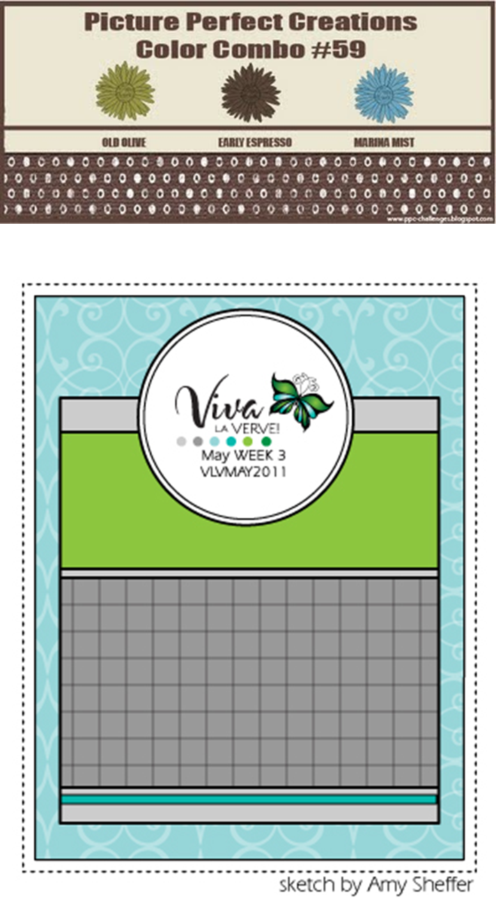
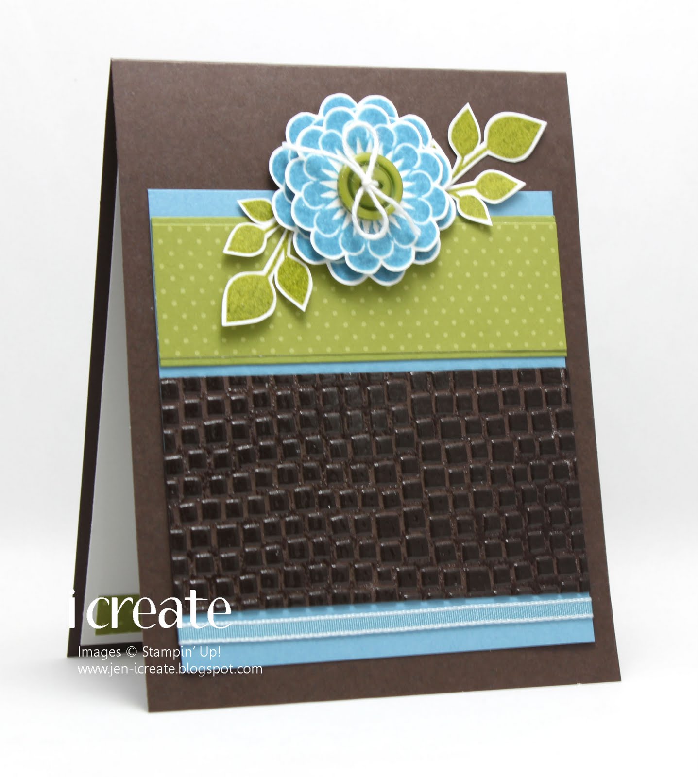
PPC59 and Viva La Verve and JAI69, Whew!
I think this is (possibly) the first time I've managed to combine three challenges in one card. And one of those challenges that I managed to squeeze in was just a happy coincidence! I actually started making this card on Thursday for the Picture Perfect Creations color challenge and one of the Viva La Verve sketch challenges for May. Take a look.
So I had settled on the colors and the layout and I had a basic idea of how I wanted the card to look. But I was tired last night, so I went to bed instead of finishing up. Then tonight I sat down in my stamp room and picked a floral image that I wanted to use for my card.
I embossed the Early Espresso faux-alligator layer with clear embossing powder, then I couldn't seem to put the clear embossing powder down! I stamped the floral images in Marina Mist, and embossed them too. Then I stamped the leaves in Old Olive and thought they would look better embossed as well. It's all quite shiny and lovely in real life! So as I was cutting out the flowers and the leaves I realized that this card fit the Just Add Ink challenge this week of Fussy Cutting and my happy coincidence was born!
Thanks for stopping by!
Friday, May 20, 2011
PPC Sketch Challenge and Color Dare 101
For my card today, I went with the sketch challenge at Picture Perfect Creations and the color challenge at the Color Dare: Old Olive, Regal Rose, and Early Espresso.
It seems like it's been ages since I've made a card with Early Espresso. And this color challenge gave me an excuse to use it and the Early Espresso bakers' twine. A while ago, I bought the twine but hadn't used it. I use crochet thread quite a bit on my cards, so the other day I made a card and used the white baker's twine instead of the crochet thread. I really liked the weight of it and it didn't have the tendency to twist around itself like the crochet thread does.
Since I liked it so much, I thought it would be worth it to buy one of those big cones of baker's twine that you find at bakery supply stores. I found one selling white twine and the price was ok considering the amount of twine I was buying. Well, I got it the other day in the mail. The bad news is that it's not really white. It's more of a natural, unbleached color but that's ok because I can still use it. What I was shocked to see is just how much twine I got. The total amount of the cone is 3,024 YARDS! That's right YARDS, not FEET! There's enough twine on this thing to wrap me up mummy style! In fact, that may be what I do with it because there's no way I'll be able to use that much twine in my lifetime! Live and learn, I say!
Thanks for stopping by today and I hope you have time to stamp today!
It seems like it's been ages since I've made a card with Early Espresso. And this color challenge gave me an excuse to use it and the Early Espresso bakers' twine. A while ago, I bought the twine but hadn't used it. I use crochet thread quite a bit on my cards, so the other day I made a card and used the white baker's twine instead of the crochet thread. I really liked the weight of it and it didn't have the tendency to twist around itself like the crochet thread does.
Since I liked it so much, I thought it would be worth it to buy one of those big cones of baker's twine that you find at bakery supply stores. I found one selling white twine and the price was ok considering the amount of twine I was buying. Well, I got it the other day in the mail. The bad news is that it's not really white. It's more of a natural, unbleached color but that's ok because I can still use it. What I was shocked to see is just how much twine I got. The total amount of the cone is 3,024 YARDS! That's right YARDS, not FEET! There's enough twine on this thing to wrap me up mummy style! In fact, that may be what I do with it because there's no way I'll be able to use that much twine in my lifetime! Live and learn, I say!
Thanks for stopping by today and I hope you have time to stamp today!
Monday, May 16, 2011
PPC58 and SSSC117 Thank You
I've been kicking around the Picture Perfect Creations color challenge in my head for a week and I finally came up with an idea for a card using the Sweet Sunday sketch challenge.
I love these long and narrow cards. They're so unusual! For mine, I cut a piece of cardstock 6 1/2-inch square and scored it down the middle . It fits perfectly in the SU! Small Open-End Envelopes.
This color challenge called for Tangerine Tango so I was happy to use the Tangerine Tango embossing powder for my flowers. I stamped the leafy image from the Fabulous Florets stamp set in Chocolate Chip then layered my Tangerine Tango flowers on top. I used extra-puffy 3D glue dots to adhere the flowers, so in real life there's quite a bit of dimension.
Thanks for stopping by and I hope you have time to stamp today!
I love these long and narrow cards. They're so unusual! For mine, I cut a piece of cardstock 6 1/2-inch square and scored it down the middle . It fits perfectly in the SU! Small Open-End Envelopes.
This color challenge called for Tangerine Tango so I was happy to use the Tangerine Tango embossing powder for my flowers. I stamped the leafy image from the Fabulous Florets stamp set in Chocolate Chip then layered my Tangerine Tango flowers on top. I used extra-puffy 3D glue dots to adhere the flowers, so in real life there's quite a bit of dimension.
Thanks for stopping by and I hope you have time to stamp today!
Thursday, May 5, 2011
MOJO189 and PPC57
Usually on Thursday I'm showing off a card for the ColorLab challenge. But this week we're taking break because Julie, our challenge hostess, is grieving over the loss of her grandmother. I hope you'll stop by and show her some love. Next week we'll be back with a new challenge and I hope you'll join us then.
So today I decided to show you a card I made for the MOJO and Picture Perfect Creations challenges.
I loved the layout and I loved the color challenge, so I had no trouble putting them both together here!
And finally I found a use for those Sweet Stitches buttons! So cute!
Thanks for visiting and I hope you have time to stamp today!
So today I decided to show you a card I made for the MOJO and Picture Perfect Creations challenges.
I loved the layout and I loved the color challenge, so I had no trouble putting them both together here!
And finally I found a use for those Sweet Stitches buttons! So cute!
Thanks for visiting and I hope you have time to stamp today!
Tuesday, April 26, 2011
MOJO 188 and Picture Perfect Creations 56
I love the color blue, so there was no way I was going to miss participating in the Picture Perfect Creations color challenge this week. I paired the color challenge with the MOJO sketch challenge.
The last MOJO challenge of the of the month is always a choice between a round or square card and this month I've chosen square.
Luckily I had some scraps from the Urban Garden designer paper, which had both Not Quite Navy and Baha Breeze among its pages, so I was able to use them here. That beautiful butterfly is from the Simple Frienship stamp set that I have been eyeing for some time and finally decided to buy! I inked it up in Pear Pizzazz then embossed it with clear embossing powder to make it a little more special!
Thanks for stopping by and I hope you have time to stamp today!
The last MOJO challenge of the of the month is always a choice between a round or square card and this month I've chosen square.
Luckily I had some scraps from the Urban Garden designer paper, which had both Not Quite Navy and Baha Breeze among its pages, so I was able to use them here. That beautiful butterfly is from the Simple Frienship stamp set that I have been eyeing for some time and finally decided to buy! I inked it up in Pear Pizzazz then embossed it with clear embossing powder to make it a little more special!
Thanks for stopping by and I hope you have time to stamp today!
Wednesday, April 13, 2011
PPC55 Color Challenge
The color challenge this week at Picture Perfect Creations is what I consider to be a nice combo for a masculine card. I hardly ever make those, so it's a nice change for me!
I'm not sure why I always seem to associate a beautiful color like Not Quite Navy with a masculine card, but I do. And for some reason I also seem to reach for the Seeing Stars stamp set, when I need to make one. It's a very versatile set for kid's card, masculine cards, or even patriotic cards.
Thanks for stopping by and I hope you have time to stamp today!
I'm not sure why I always seem to associate a beautiful color like Not Quite Navy with a masculine card, but I do. And for some reason I also seem to reach for the Seeing Stars stamp set, when I need to make one. It's a very versatile set for kid's card, masculine cards, or even patriotic cards.
Thanks for stopping by and I hope you have time to stamp today!
Tuesday, March 29, 2011
PPC53
The newest color challenge at the Picture Perfect Creations blog was very interesting to me, so I wanted to give it a try.
I thought I probably had some Chocolate Chip and Real Red designer paper in my stash that I could use to pretty up the card I had in mind and I was right. No matter that the dp I chose was from a collection called "Ski Slope." I've never subscribed to the belief that you have to use designer paper for the occasion that it was intended. For example, something called "Ski Slope" should properly be used for a winter theme, or perhaps a holiday theme. But as you can see, I've used it for something completely different.
My layout is a sketch challenge from the Clean & Simple blog, but (apologies to the folks at the Clean & Simple blog), I could not find the post for this challenge so that I could link to it and show you what the sketch looks like. I can say that this was sketch 3 and that I've copied it quite faithfully. My only regret here is that the sentiment and little star that I stamped in Chocolate Chip don't really show up on the photo.
Thanks for stopping by and I hope you have time to stamp today!
I thought I probably had some Chocolate Chip and Real Red designer paper in my stash that I could use to pretty up the card I had in mind and I was right. No matter that the dp I chose was from a collection called "Ski Slope." I've never subscribed to the belief that you have to use designer paper for the occasion that it was intended. For example, something called "Ski Slope" should properly be used for a winter theme, or perhaps a holiday theme. But as you can see, I've used it for something completely different.
My layout is a sketch challenge from the Clean & Simple blog, but (apologies to the folks at the Clean & Simple blog), I could not find the post for this challenge so that I could link to it and show you what the sketch looks like. I can say that this was sketch 3 and that I've copied it quite faithfully. My only regret here is that the sentiment and little star that I stamped in Chocolate Chip don't really show up on the photo.
Thanks for stopping by and I hope you have time to stamp today!
Saturday, March 12, 2011
Just Add Ink 59 and Picture Perfect Creations 51
Today I attempted to make a card following the very lovely color combo over at the Picture Perfect Creations blog along with the layout from Just Add Ink.
I say "attempted" because I was very busy putting together my card which consisted of More Mustard, Poppy Parade, Soft Suede and Very Vanilla. I was just getting ready to take a photo when I looked at the color challenge and saw that I completely forgot about Baja Breeze! How could I forget Baja Breeze? I debated whether I wanted to re-do the card with all the colors or just keep the one I've got and forget about participating in the color challenge. In the end, I ripped off a portion so that I could incorporate the Baja Breeze!
I think that since the Baja Breeze was basically an afterthought with this card, its use seems a bit forced here. If I had remembered it earlier, I think I would have colored some of the flowers with it. But even so, it's not horrible. I've certainly made worse! Earlier today I went to the bridal shower for my nephew's fiancee. I made the shower favors for everyone and I took this picture of one on the table.
Unfortunately, the picture is a little blurry, but you get the idea. I think everyone liked them!
Thanks for stopping by and I hope you have time to stamp today!
Tuesday, March 1, 2011
A Very Sweet, Picture Perfect Birthday
Today I decided to combine the Sweet Sunday sketch challenge with the Picture Perfect Creations color challenge. A birthday card was my final result.
I'm pretty sure that I need to get an Early Espresso re-inker because I had a rather difficult time inking up the center of my flower here:
It's funny how sometimes my ink pads are super-juicy and other times not so much. This is one of those not-so-much ones. Funny how, for me, these tend to be the darker colors. I'm not sure if this is a coincidence or not! I'll have to conduct some experiments to find out!
Thanks for stopping by and I hope you have time to stamp today!
Tuesday, February 22, 2011
An Anniversary Challenge
The other day I discovered a new (to me) challenge blog. It's called Picture Perfect Creations and I decided to give it a try. The challenge this week was a color challenge with an anniversary theme.
I really liked the colors, but I hesitated joining the challenge at first because after an extensive search of my stamp sets, I realized that I didn't have an anniversary one! I finally found one that I thought would be an appropriate sentiment and along with the Pals Paper Arts sketch challenge this week, I set to work.
I found this sketch a little intimidating at first, but once I had a chance to take a good look at it, I was able to break down the elements of it into manageable pieces!
I love Basic Gray (which is what attracted me to this color challenge to begin with), and when paired with a bright color like Melon Mambo I'm helpless to resist! I'm also gaining a new appreciation for Garden Green. I've not used it very much, but it's really a very nice color and makes an excellent stem!!
Thanks for stopping by and I hope you have time to stamp today!
I really liked the colors, but I hesitated joining the challenge at first because after an extensive search of my stamp sets, I realized that I didn't have an anniversary one! I finally found one that I thought would be an appropriate sentiment and along with the Pals Paper Arts sketch challenge this week, I set to work.
I found this sketch a little intimidating at first, but once I had a chance to take a good look at it, I was able to break down the elements of it into manageable pieces!
I love Basic Gray (which is what attracted me to this color challenge to begin with), and when paired with a bright color like Melon Mambo I'm helpless to resist! I'm also gaining a new appreciation for Garden Green. I've not used it very much, but it's really a very nice color and makes an excellent stem!!
Thanks for stopping by and I hope you have time to stamp today!
Subscribe to:
Posts (Atom)