Showing posts with label Stamping 411. Show all posts

Saturday, March 3, 2012

Deconstructed Sketch 41 and Stamping 411 Color Inspiration 168

I had forgotten that on the first Thursday of the month Stamping 411 hosts a color challenge.  This week I happened to discover it as I was checking out their latest sketch challenge.  And once I got a look at it there was no way I was not going to participate.


I love a card that has some basic black and a pop of color.  And lucky me, this one has three pops of color!   I used a wonderful piece of herringbone DSP from the retired Night & Day collection.  The flower is cut from the Flower Daisies #2 die and is finished off in the center with an antique brad.  I almost got away with no stamping on this card, until I decided to add a little sentiment from Tiny Tags.  My layout sketch is this week's Deconstructed Sketch.


This card has lots of wonderful layers that add some lovely heft to this card.  I know I'm usually pretty clean when it comes to my cards, but I must confess that I secretly love lots of layers.  There's something about picking up a card that feels somewhat heavy because it's got a lot going on!  Even still, I think I've stayed true to my clean and simple style.

And I can't forget to mention the ribbon.  I dyed some seam binding ribbon with Pink Pirouette reinker and it actually worked!  I know it seems rather white in the photo, but in real life, it is pink!  My last attempt at dying ribbon didn't work so well so I was very excited to see this little bit of success!

Thanks for stopping by!

Monday, January 9, 2012

PP77, CCMC184, SSC237 {Whew}

It's not very often that I combine three challenges to make one card, but I managed to do it for this card!


The Paper Players challenge is "All You Need is Love" so I made a Valentine's Day card with the Love You Much stamp set.  I combined it with the color challenge at Create With Connie and Mary and the sketch challenge at Stamping 411.

It's fun to sometimes use non-traditional colors for holidays, so that's why I thought I'd make a Valentine's Day card with Blushing Bride, Pool Party and Soft Suede.  But by the time I put this together I wasn't at all sure that I liked the result.  I thought about coloring in the "love" sentiment with Blushing Bride but I was afraid that the Soft Suede outline would run.  I ended up by lightly sponging the embossed Pool Party vertical pennant.  I'm not sure that it jazzed this up all that much, but it looks a little better to my eye.


I also remembered that I mentioned last week that I wanted to share some photos of an ink pad storage system that I received for Christmas, and then I completely forgot to upload the photos!  So here it is:


This holds 96 ink pads plus markers and ink refills!  Oh my!  Here's a close up.


It came unfinished, so I stained it then gave it a couple of coats of polyurethane.  I love it.  It's big, but it is exactly what I needed to keep everything organized.  Santa is so awesome!

Thanks for stopping by for a visit today!

Monday, December 19, 2011

Stamping 411 Sketch 234

For some reason I got to thinking about watercoloring yesterday.  I hadn't done any of that in quite some time so I thought I do a little practicing.


I love using the leafy stamp from Growing Green to watercolor.  I colored it with a Wild Wasabi marker then dragged the color around with an aqua painter.  The companion designer paper is from Woodland Walk and the sentiment is from Much Appreciated.  The layout is courtesy of the Stamping 411 sketch challenge.


Now, you might be wondering what is up with that tie-dyed ribbon.  That is an experiment gone awry!  Several months ago I tried to dye a piece of Very Vanilla seam binding ribbon.  I soaked the ribbon in some water that I had added a few drops of Wild Wasabi ink to.  But the ribbon wouldn't take the color and this is what I ended up with.  I'm not sure why, but I saved it and I came across it as I considered what ribbon to use on my card.  It's actually kind of pretty in real life and the colors go perfectly with this card!  That's some serendipity!

Thanks for stopping by!

Monday, November 21, 2011

Paper Players 73 and Stamping 411 Sketch 230

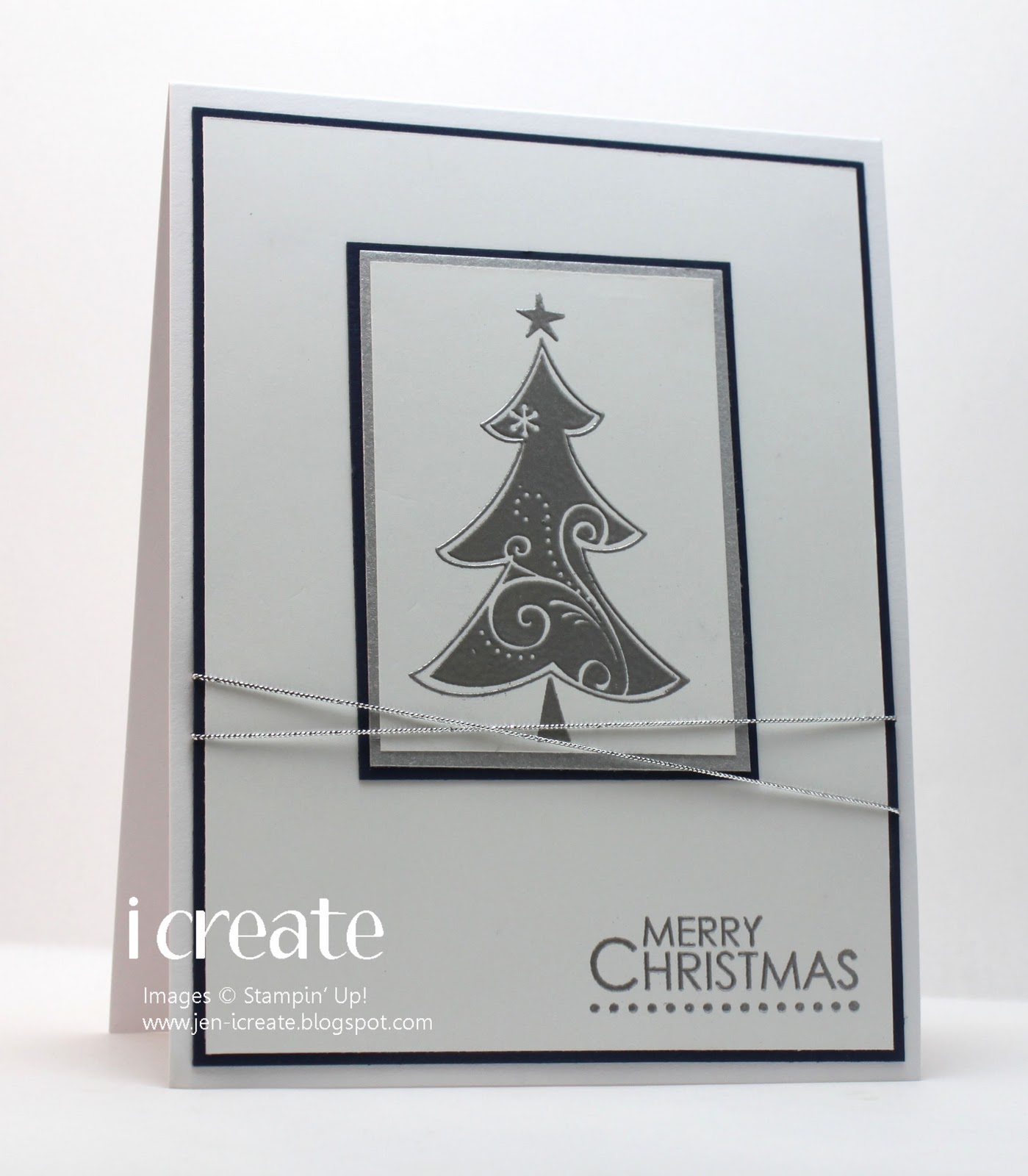
I absolutely loved Jaydee's challenge for us this week at The Paper Players.  The challenge is to make a card that is clean and simple using the colors Night of Navy, Whisper White and silver.


The design team cards are absolutely gorgeous and really got my creative juices flowing.  So I thought I'd make a card combing this challenge with the sketch at Stamping 411.


I wish I didn't have such a hard time getting a decent photo of a white card.  The color is always off.  Argh!  But anyway, as you can see, I substituted the square scallop from the sketch for some plain rectangles because I really wanted to use the tree from Season of Joy and it didn't look so great on a square.  (What I really need are some rectangle scallop dies and my problem would be solved)!

I embossed the tree and the sentiment (also from Season of Joy) in silver embossing powder.  And I don't mind saying that in real life, it looks fantastic.  Not a stray piece of embossing powder to be had!  Thank you Embossing Buddy!!

I'm in the home stretch of my vacation and today I'm homebound while my car is getting a ding on my bumper fixed.  My plan is to stay focused and finish up my Christmas cards.  And if I can squeeze it in, I'll try to work on some Christmas treats too.

Thanks for stopping by!

Saturday, November 12, 2011

CCMC175 and Stamping 411 229

I recently (unintentionally) conducted an experiment.  I have spent several days away from my stamp room and have concluded that this is a mojo killer.  Earlier today I sat down at my table with the intention of making a card combing the Create With Connie and Mary color challenge and the Stamping 411 sketch challenge.


I wasted a lot of time staring at my stamps and wondering what in the world I was going to make.  I couldn't seem to make a decision.  So I stepped away for a couple of hours because this usually helps to clear my head.  I don't think it did.  I'm still feeling out of sorts.

But I persevered and I used my old favorite French Foliage to make this poinsettia from the small leaf in that set.  I stamped it in Craft White onto some Cherry Cobbler cardstock.  I added some Basic Pearls in the center which looks nice and covers up the messy part where the ends of the leaves meet.  The sentiment is from Four the Holidays.


I'm off to get back to my stamp room to get my creative juices flowing.  I've seen some nice challenges that I'd like to participate so I better get cracking!  Thanks for stopping by today!

Sunday, September 25, 2011

Color Throwdown 160 and Stamping 411 Sketch

I've taken a little break from my Christmas cards to participate in the Color Throwdown challenge.  The colors are awesome and the inspiration from the design team was very..........inspiring!

Add in the wonderful CAS sketch this week at Stamping 411 and my creative juices got going.


I had a general idea in my head how I wanted this card to look, but as I got assembling all the pieces I realized that I didn't know what stamped images I wanted, which meant I had trouble deciding how to proceed.  Despite all the stamps I have, sometimes it seems like I don't have exactly the one I want!  I eventually settled on a sentiment from Whimsical Words, a Sale-A-Bration set from last year, and an image from Simply Soft, a hostess set from the current catalog.  I opted to forgo the bow in the sketch, because I wanted to keep the layout of my card pretty clean.

I love working with colors like these.  There's just something about them that catches my eye and I'm happy to send a big thank you to Danielle from the Color Throwdown DT for picking them!

Thanks for stopping by!

Tuesday, September 13, 2011

Stamping 411 Sketch Challenge 220

I've been in a mood lately to use up some of my old designer series paper.  So for today's card, which uses the Stamping 411 sketch, I found and used some paper called Apple Cider.

Among other colors, it features Chocolate Chip, Really Rust, and River Rock.  Although I still had some bits of Really Rust cardstock left, oddly I didn't keep the ink so I substituted Dusty Durango instead.  I was pleased to see the colors are pretty close.

I rock and rolled the leaves in Dusty Durango and Chocolate Chip.  (Really what is it about those leaves that somehow demand the rock and roll technique)?  A vintage brad captures a small bit of crochet trim ribbon and the sentiment is from Matchbox Messages.

Thanks so much for stopping by today!

Monday, September 5, 2011

CCMC165 and Stamping 411 Sketch 219

The color challenge this week at Create With Connie and Mary made think of Halloween.


 So with a color scheme in mind I searched around for a sketch challenge and thought the latest Stamping 411 challenge would be just the thing.

I love making things for Halloween.  Cards, favors, you name it, I love it.  It seems like it's been ages since I've used one of my Halloween stamp sets so this was a lot of fun.  For this card I used a couple of stamps from the Halloween Hoot stamp set.  I colored the frog with a blender pen in Lucky Limeade.  I didn't have any buttons, so I once again made my own with the Sweet Buttons embosslit. 
I hope this inspires me to make some more Halloween things before the season is over.  I know it's only the beginning of September and I should have plenty of time, but time has a way of steam-rolling past and before you know it, it will be Christmas!

Thanks for stopping by today!

Thursday, September 1, 2011

Color Throwdown 157 and Stamping 411 Sketch 218

I've been in a Crumb Cake mood a lot lately.  It seems that all the cards I've made lately have got some Crumb Cake in them so it was inevitable that this weeks color challenge at Color Throwdown featured it too.
This is a great color combo.  I think that Marina Mist is a lovely blue color and I should use it more often.  I feel like Bravo Burgundy is the forgotten color of the bunch.  It always seems to make an appearance around the holidays, then is quietly put away for a year until the holidays roll around again.  And Lucky Limeade needs no introduction.  It's just great all around.  So all this colorful goodness was put to use for the Stamping 411 sketch challenge.

I went WAY into the vault for some of the elements on my card.  Take a look and I'll explain.


For starters I used the wonderful flower from the Best Blossoms stamp set.  I have mentioned a time or two here that it is probably my all-time favorite stamp set and as I sat down to contemplate my card I realized that those flowers hadn't seen any ink in quite some time.  Then, I poked around my stash to see if I had any Bravo Burgundy designer paper.  I did not, but I did have something that was very close.  Back in olden days, when Stampin' Up! first decided to create the In Colors, there was a color called Cranberry Crisp.  I happen to have some Christmas designer paper that featured this color and it is a very close match to Bravo Burgundy.  So that's what the polka-dotted paper is on the bottom of my card. 

Now, if you'll indulge me for a bit I would like to reminisce about that first batch of In Colors.  I loved every one of those colors (with the possible exception of Marigold Morning).  The other colors were the aforementioned Cranberry Crisp, True Thyme, Cool Caribbean, Buckaroo Blue and my favorite, Vintage Violet.  The designer paper that I used on my card was from a pack called Holiday Thyme.  To this day, it is very likely my favorite designer paper and I rarely use it.  Every so often I take it out to admire it because I can barely bring myself to cut it.  I hope I'm not the only one who forms strange attachments to paper!

Anyway, thanks for joining me on my little trip down memory lane and for taking the time to visit.

Sunday, July 10, 2011

PPC 64: The hardest color challenge ever!

Last Monday I checked out the color challenge at Picture Perfect Creations and thought I was seeing things!  The Soft Suede, Peach Parfait, and Cherry Cobbler made picture perfect (pun intended) sense to me.  But wait!  They decided to throw in Pacific Point to make things interesting!

That's not so much interesting as downright scary!  I had no idea what to do, or how I could possibly make this work.  So I closed my browser window and decided to sleep on it for a few days.  By Sunday I figured I had evaded this challenge long enough so I picked the Stamping 411 sketch challenge to be my victim partner in crime.

The sketch was good.  Clean lines, lots of layers.  Everything I like in a sketch.  But pairing it with this color challenge was definitely challenging!

I decided to take a sort of color-block approach to this card.  Each layer is focused on one of the colors so that they sort of exist by themselves.  Actually, one of the first thoughts I had about this card was doing an image that I could color {a snowman with a colorful scarf} but to tell the truth, by the time I sat down to make this card, it was hours after the original thought and I had completely forgotten about that idea!  Oops!  So this is what emerged.  I'm not in any way sold on this.  It seemed so much better in my head when I was designing it! 

I'm glad I attempted this challenge.  It's fun to try something that you are a little afraid of, isn't it?  After all, it's only a bit of color, not bungey-jumping off a bridge or something! 

So on that thought I will leave you with good wishes for a happy Sunday!

Saturday, July 2, 2011

Stamping 411 Sketch Challenge 210 and ColourQ 91

Every week I check out the color challenge at the ColourQ and every week I want to give the challenge a try.  Sometimes finding the time to participate in the challenge is difficult, but I love to when I can.  Today, I carved out some time to get inky with their latest challenge.

So, as I usually do, I find one challenge (either color or sketch) then I begin the search for another challenge to go with it.  This time I thought the Stamping 411 sketch challenge would be a good fit for what I had in mind.
I have to confess that even though I thought that this sketch would be "a good fit for what I had in mind" I had no idea what I had in mind!  Sometimes (actually a lot of times) when I pair a color challenge with a sketch challenge I make the decision purely on how well the number of layers of the sketch compare to the number of colors in the color challenge.  So when I decide that this color challenge will go well with that sketch challenge, I'm really guessing and ultimately taking a huge leap of faith!

Fortunately, this method seems to work out for me (although I've made some really horrible cards in my day), but this card is one that I'm actually pleased with.

The extremely talented Vicky has been using one of my all-time favorite stamps sets quite a bit lately (French Foliage), so I was reminded that I missed making cards with it and it was probably lonely just hanging around in my stamp room with nothing to do.  Of course, I put it to work on my card here and it's good to see it again!  Now, if you're thinking that the Night of Navy button seems a little out of place you're right! This was one of those instances where I had put my card together then checked the color challenge out again to make sure I had it right.  Lo and behold I had forgotten the Night of Navy!  So I added the button at the last minute, but I have to say that I think it looks pretty good.  It kind of messes up the sketch challenge, but not so badly (I hope) that I will be sent to the sketch challenge dungeon!

Thanks for stopping by and Happy July 4th to all my American visitors!

Sunday, June 26, 2011

Stamping 411 Sketch Challenge 209

Once the weather turns summery I always have a hard time bringing myself to stay inside and spend some quality time in my stamp room.  I like to be outside with the sun on my face and there always seems to be a weed or two, or a million, that need pulling up!  So today after doing some yardwork outside, I found that I had time to wander inside and make a card for the Stamping 411 sketch challenge.

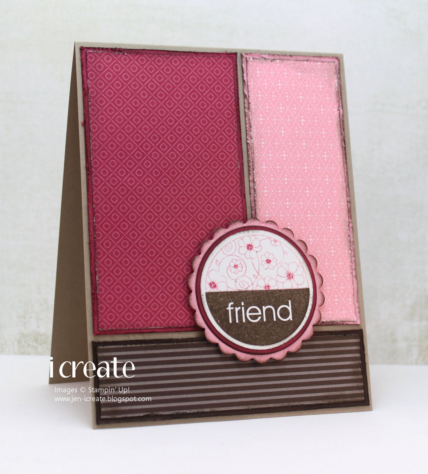
I love a sketch that has big, bold geometric designs like this.  I decided to pair it with the Utah Divas International color challenge to use Early Espresso, Rose Red, Crumb Cake and Pretty in Pink.

I'm not sure why, but when I see these particular colors together I want to do a little distressing.  So I very lightly distressed the edges of all the layers including the round ones with some Early Espresso.  I used the sentiment from the soon to be retired Simple Friendship stamp set.  This is one of the sets that I consider to be a keeper because the butterly stamp included in the set is absolutely gorgeous and there's no way I'm giving it up!
Thanks for stopping by!

Friday, June 10, 2011

Stamping 411 Sketch Challenge 207

I've made a few graduation cards lately, but none of them were exactly what I was looking for when I thought about the card I wanted to give my nephew (who graduated from high school last week).  I had been kicking around some ideas in my head, but hadn't setlled on one.  Then tonight I looked at the Stamping 411 sketch challenge and I thought that it would be absolultely perfect for what I {thought} I had in mind.

And for (what I think) is the first time ever, I have flipped a sketch!  This is big for me.  I'm not usually a rule breaker!  If I see a sketch in landscape format, I dutifully make a card in landscape format.  But today I really wanted to use this sketch, only I wanted they layout to be portrait.  So, with apologies to the folks at Stampin 411, I present my (slightly altered) card.

My nephew has graduated from my old alma mater, and our school colors are orange and black.  So, of course, I made a card using those colors.   Although Pumpkin Pie would probably be a better choice for the orange, I really wanted to use the designer paper that looked sort of like notebook paper and that only came in Peach Parfait.  I stamped the "congratulations" from the Go Graduate stamp set, and followed it up with some phrases from the Happy Grad stamp.

He'll be off to Boston College in the fall to begin a whole new chapter in his life. I can hardly believe that he's old enough to be on his own, but there you have it.  I'm sure he'll be just fine, even if he does leave behind a weepy aunt!

Thanks for stopping by!

Saturday, May 28, 2011

Sketchbook Saturday 13 and Color Inspiration 157

It's late on Saturday, but I finally finished my card for the Sketchbook Saturday and Color Inspiration challenges. 

I've been watching movies on TV while making this card, which is VERY distracting.  I'm pretty sure I could have finished it hours ago if I was concentrating a little harder!

I stamped the background of my oval layer with En Francais.  I think it makes a nice background for the floral images from the Fabulous Florets stamp set, which you may have noticed that I watercolored.  And I'm pretty sure that I have had a watercoloring epiphany!  Previously, my attempts at watercoloring involved my very unprofessional attempts at shading and applying the colors "just so."  Well today, quite by accident, I applied the color in a rather slap-dash method.  I sort of swirled the colors around, left some "white" space and I've got to say that I really like how it turned out.  It really looks like watercoloring to me!

Thanks for stopping by today!

Tuesday, May 24, 2011

ColourQ 86 and Stamping 411 Sketch 204

I didn't think I was going to get a card in today, but I managed to do it.  I had a pitstop to make after work and I thought that by the time I made it home I'd be in no mood to be creative.  But to my surprise, I did some laundry then found myself thinking that since I had nothing else to do, I might as well sit down in my stamp room, watch the Red Sox, and see if I could come up with something.

Luckily the ColourQ and Stamping 411 challenges provided some inspiration!

As usual, when I see the ColourQ challenge I am full of ideas.  However, when I sit down to make a card, all those ideas go out the window and what I end up with is not what I intended when I started!


As I looked around my stamp room searching for ideas, I spied some of my glossy card stock that was alread prepared for the mother-of-pearl technique.  So I sponged some Daffodil Delight and Real Red on it and used the flower stamp from the Growing Green stamp set to create the flowers you see here.  That polka dotted designer paper is from some long-retired SU! paper from my stash, and I thought it was awfully cute!  As I mentioned this is not the card I dreamed of when I saw this awesome color challenge, but this is what I ended up with!  Funny how that happens sometimes!

Thanks for stopping by today!

Tuesday, May 10, 2011

MOJO190 and Stamping 411 Color Inspiration 156

This week the color challenge at Stamping 411 included Basic Black, which for me means a bold and dramatic color scheme.  The color challenge also included Pear Pizzazz and Tempting Turquoise so I when I combined all those colors together I ended up with a very pretty card.

I got a lot of help from the MOJO sketch challenge!


I've always felt that using a dramatic color such as Basic Black is a great way to call attention to your project without overpowering it.  On my card, I've just a touch of it on my scalloped square and on the sentiment, but I think it gives the card a bold look without stealing the show!

Thanks for stopping by and I hope you have time to stamp today!

Saturday, May 7, 2011

Birthday Wishes Brought To You By the Letter P

The color challenge this week at Pals Paper Arts is all about the letter P:  peach, pear, and poppy.
Lovely colors aren't they?  I was puttering around my garden today doing some weeding and assessing things.  Trying to figure out what did not survive the brutal winter we had.  So I had flowers on my mind when I sat down to make a card.  I used the Stamping 411 sketch for a layout.


I used the Greenhouse Garden stamp set because I wanted to do a bit of two-step stamping.  I thought that it would look nice if I stamped the flower in Peach Parfait first, then stamped the detail stamp with Poppy Parade.  I like how it came out.  Then the small flower is just stamped in Poppy Parade.  I had to stamp off twice to get the color light enough so that the detail stamp would show up.

And last but not least, I tried my hand at a little crinkly seam binding ribbon.  I keep seeing this all over blogland and I really liked it, but for some reason nobody wanted to give up the secret to creating the look.  I thought I had read somewhere about heating it up with a heat gun, but I tried that and it didn't do anything except blow the ribbon around my stamp room.  So then I tried wetting it first, then I put the heat gun on it, and all I achieved was a wet ribbon blowing around my stamp room.  So then I posted a question on Splitcoast and got an answer pretty quickly.  And it's so simple:  wet, scrunch, dry.  Apparently, most people let it dry overnight.  You can use the heat gun to speed things up, but the heat tends to flatten out some of the crinkles.  But as luck would have it I accidentally discovered a quick way to do it.

I already had the little piece of ribbon that I wet first, then dried with the heat gun.  I crinkled it up in a very tight ball then carefully unravelled it.  I got a very nice soft, but crinkly ribbon.  Then I cut another small piece off the spool and crinkled it up.  I didn't like the look at all.  The crinkles were sort of sharp looking and the ribbon itself didn't have the soft look of the first one I did.  So I wet it, dried it with the heat gun, then crinkled it into a tight ball again.  When I unravelled it, it was just the softer look I was going for.  I think wetting it first sort of softens up the fibers of the ribbon so that it crinkles better.

Please excuse my ribbon ramble, but I'm so happy I figured this out.  I'm sure everybody else out there has known about this for ages and is wondering why I'm so late to the party!  But thanks for stopping by!

Sunday, May 1, 2011

Stamping 411 Sketch Challenge 201

So far May is shaping up to be a very busy month for me.  Later today I'll be going to my cousin's wedding then on Tuesday is my nephew's confirmation.  I wanted to make a card to congratulate him, so I turned to the Stamping 411 sketch challenge for a layout.

I chose Crumb Cake, Chocolate Chip, and So Saffron as my colors because I figured they weren't too girly.  But on second thought, I love those colors so they must be girly!

I've had these corduroy buttons hiding in my stash for quite a while and I think they're so cute.  My nephew is always teasing me about embellishments that I put on my card.  He doesn't understand that buttons are not just for shirts!  And a corduroy one is even better!

Well, it's back to the drawing board for me.  I've got a 50th wedding anniversary party to go to in a couple of weeks, so I'll need to make a card for that.  Thanks for stopping by and I hope you have time to stamp today!

Monday, April 25, 2011

SSSC114 and Stamping 411 Color Inspiration 155

The Color Inspiration challenge this week at the Stamping 411 blog had me stumped.

But I generally don't like to say "no" to a color challenge so I figured I better get to work on something!  Enter the Sweet Sunday sketch challenge.

Individually, I like all of these colors.  But contemplate putting them all together on one card and I may start to panic!  In the end, I think I played it a little bit safe as you shall see.

Once again I've chosen the Fabulous Florets stamp set for my main image panel.  It makes lovely flowers in any color you can imagine.  I really, really tried to use something else here, but I just couldn't find anything that I liked half as much, so I played it safe and created flowers using Pacific Point and Tangerine Tango.  Against a background of Riding Hood Red, I think this makes a lovely card for Mother's Day.

Thanks for stopping by and I hope you have time to stamp today!

Monday, April 11, 2011

SSSC112 and Stamping 411 Color Inspiration 154

As usual on Sunday, I check out the Sweet Sunday sketch challenge.  Then I began hunting around for a color challenge to go with it.  I remembered that the Stamping 411 blog has a sketch challenge too and the colors were pretty awesome, so I combined the two.

Pretty early on I knew that I wanted to use flowers in place of the stars on the sketch graphic.  The dilemma was which one.  I tossed around a few ideas then I spied one of my all time favorites:  the flower from the long-retired Best Blossoms stamp set.

I'm fairly certain that I will always have this stamp set.  If only to keep my hands on this fabulous flower.  I rarely use any of the other stamps in the set, but that's okay because this flower makes up for it.  I'm not sure why I love it so much, but I do!

I think this is the first time I've participated in the Stamping 411 color inspiration challenge and the funny thing is, that I almost messed it up.  The card was made, I was almost done typing this post when I looked again at the graphic for the challenge and realized that I completely forgot the Chocolate Chip!  What's a girl to do?  Well, I pried off the Always Artichoke buttons that I had adhered to the card and put some Chocolate Chip ones on instead.  Whew!  That was a close one!

Thanks for stopping by!