I took the opportunity of Jen Brum's new sketch at Freshly Made Sketches to add a masculine themed birthday card to my stash! Woo hoo! Those boy cards sure are hard to put together but the angles on the sketch put me in mind of plaid which I associate with babies and men. That didn't come out right LOL!
I new right away when I saw the sketch that I wanted to use patterned paper on my card. So I started perusing my stash and found this oldie but goodie from Stampin' Up! I chose this plaid pattern then decided how big I wanted my triangle to be, cut a rectangle, then cut it from corner to corner to create my rectangle. Easy peasy, right?
I made this card a few days ago and was pleased as punch at how easy it went together. Then Tuesday night I photographed it. It's funny how things look different through the lens of the camera. Somehow the reality of what you have created is displayed in a way that you don't see with the naked eye. Well, in this case I saw that the angle of my triangle in no way matched up the angle of the lines of the plaid. It's all helter skelter! Doh! I still like it (and I'm pretty sure that whatever man is the recipient of this card won't notice) but next time I dig out the plaid I will be a bit more thoughtful before I put it on my paper trimmer!
Thanks for stopping by! Our Freshly Made Sketches design team has put up some AMAZING cards to inspire you this week so I hope you'll play along with us!
Supplies
Stamps: Sentiment Birthday (Winnie & Walter)
Paper: Classic Ivory (Flourishes); Raspberry Ripple, Orchard Harvest DSP (Stampin' Up!)
Ink: Early Espresso (Stampin' Up!)
Accessories: Blueprints 15 die (My Favorite Things)
Showing posts with label Masculine Cards. Show all posts
Wednesday, May 30, 2018
Thursday, May 17, 2018
CAS(E) This Sketch 271
Hello, hello! It's time for a new challenge at CAS(E) This Sketch. I went a little liberal with the sketch...take a look.
I wanted to fill up the bottom third of my card with some fun images a-la the sketch so I chose a few swooshes in the colors of the Less Is More challenge. The big and bold cupcake on the challenge graphic became my birthday sentiment. This went together so easily!
Thanks for stopping by! My teammates at CAS(E) This Sketch have got some great cards to inspire you so I hope you'll join us in the gallery!
Supplies
Stamps: Watercolor Wonder, Birthday Bash Sentiments (Papertrey Ink)
Paper: White (Catherine Poooler)
Ink: Harvest Gold, Spring Rain (Papertrey Ink); Industrial Diamond (Altenew); Nocturne (Versafine Clair)
I wanted to fill up the bottom third of my card with some fun images a-la the sketch so I chose a few swooshes in the colors of the Less Is More challenge. The big and bold cupcake on the challenge graphic became my birthday sentiment. This went together so easily!
Thanks for stopping by! My teammates at CAS(E) This Sketch have got some great cards to inspire you so I hope you'll join us in the gallery!
Supplies
Stamps: Watercolor Wonder, Birthday Bash Sentiments (Papertrey Ink)
Paper: White (Catherine Poooler)
Ink: Harvest Gold, Spring Rain (Papertrey Ink); Industrial Diamond (Altenew); Nocturne (Versafine Clair)
Thursday, May 10, 2018
CAS(E) This Sketch 271 Meets Fusion
It's time for me to combine a couple of challenges. Every two weeks I make a card for the CAS(E) This Sketch challenge and the Fusion challenge. This week the mood of the Fusion inspiration put me in mind of a masculine card.
I thought and thought about this card for quite a few days. I had decided early on that I wanted to sponge some shades of blue on the main focal panel but didn't know what I would do for that vertical layer. My first thought was a strip of vellum (when in doubt vellum is the answer!) but started thinking about that lighthouse in the Fusion inspiration photo. A lighthouse is long and lean like that panel so it would be perfect for his sketch! I didn't have any lighthouse images in my stash so Etsy to the rescue! I bought some images, cut a few out with my Scan N Cut, and chose one that looked good to my eye. I lightly colored it in some shades of gray and there you have it! I also added a few sequins to my background and reckon that they are stars in the night sky!
At CASology the cue word is Marine. I'm adding this over there because lighthouses are associated with the seaside. And things in the sea are marine in nature, right? Plus my Dad was a Marine!
Thanks for stopping by! There's a whole lot of fun going on at CAS(E) This Sketch and Fusion so be sure to check out our challenges. My fellow design team mates have made some gorgeous cards to inspire you. I sure hope you'll join us in the gallery!
Supplies
Stamps: It's Your Birthday (Stampin' Up!); Lighthous (Pixelence)
Paper: Soft Stone, Dark Indigo (Papertrey Ink); Real Red (Stampin' Up!); Marker Paper (Strathmore); Solar White (Neenah)
Ink: Weathered Wood, Stormy Sky, Chipped Sapphire (Distress); Jet Black (Altenew); Copics
Accessories: Winter Wonderland sequins (Neat & Tangled)
I thought and thought about this card for quite a few days. I had decided early on that I wanted to sponge some shades of blue on the main focal panel but didn't know what I would do for that vertical layer. My first thought was a strip of vellum (when in doubt vellum is the answer!) but started thinking about that lighthouse in the Fusion inspiration photo. A lighthouse is long and lean like that panel so it would be perfect for his sketch! I didn't have any lighthouse images in my stash so Etsy to the rescue! I bought some images, cut a few out with my Scan N Cut, and chose one that looked good to my eye. I lightly colored it in some shades of gray and there you have it! I also added a few sequins to my background and reckon that they are stars in the night sky!
At CASology the cue word is Marine. I'm adding this over there because lighthouses are associated with the seaside. And things in the sea are marine in nature, right? Plus my Dad was a Marine!
Thanks for stopping by! There's a whole lot of fun going on at CAS(E) This Sketch and Fusion so be sure to check out our challenges. My fellow design team mates have made some gorgeous cards to inspire you. I sure hope you'll join us in the gallery!
Supplies
Stamps: It's Your Birthday (Stampin' Up!); Lighthous (Pixelence)
Paper: Soft Stone, Dark Indigo (Papertrey Ink); Real Red (Stampin' Up!); Marker Paper (Strathmore); Solar White (Neenah)
Ink: Weathered Wood, Stormy Sky, Chipped Sapphire (Distress); Jet Black (Altenew); Copics
Accessories: Winter Wonderland sequins (Neat & Tangled)
Thursday, September 7, 2017
CAS(E) This Sketch 238
It's been a while since I've made a card with a more masculine theme but that's the direction that I took with this week's challenge at CAS(E) This Sketch - despite the floral imagery on the sketch!
I'll admit I was helped along with my theme by the "for him" challenge going on at Global Design Project and the latest color challenge at Less is More. I started this card by heat embossing a circle backgkround stamp in white then filling in some of the circles with lime and blue inks. I actually had a wee circle stamp that fit perfectly inside those little embossed circles! The sentiment is a mix of a die cut and a stamp.
Thanks for stopping by. And don't forget to pop on over to CAS(E) This Sketch and take a look at what my fellow teamies have made for your inspiration. I know you're gonna love them all!
Supplies
Stamps: Amazing, Simply Circles Background (My Favorite Things); Circles Circles Circles (Whimsy Stamps)
Paper: Solar White (Neenah); Pacific Point (Stampin' Up!)
Ink: Pacific Point (Stampin' Up!); Lime Rickey (Catherine Pooler); Versamark
Accessories: Awesome die (Neat & Tangled); white embossing powder
I'll admit I was helped along with my theme by the "for him" challenge going on at Global Design Project and the latest color challenge at Less is More. I started this card by heat embossing a circle backgkround stamp in white then filling in some of the circles with lime and blue inks. I actually had a wee circle stamp that fit perfectly inside those little embossed circles! The sentiment is a mix of a die cut and a stamp.
Thanks for stopping by. And don't forget to pop on over to CAS(E) This Sketch and take a look at what my fellow teamies have made for your inspiration. I know you're gonna love them all!
Supplies
Stamps: Amazing, Simply Circles Background (My Favorite Things); Circles Circles Circles (Whimsy Stamps)
Paper: Solar White (Neenah); Pacific Point (Stampin' Up!)
Ink: Pacific Point (Stampin' Up!); Lime Rickey (Catherine Pooler); Versamark
Accessories: Awesome die (Neat & Tangled); white embossing powder
Wednesday, June 7, 2017
Freshly Made Sketches 291
It's Wednesday so that means it's time for a new challenge at Freshly Made Sketches. This week Jen Brum is our hostess and her sketch made me think of patterned paper.....at first.
I totally intended to use some patterned paper for those two rectangle layers and accent them with some flowers (the "circle") but then I stumbled upon an old stamp set with bowling balls and thought "that would work!" That negated the need for patterned paper and I was able to make a one layer card instead.
I hand-drew the rectangle layers and just drew the bottom one around the bowling pins. I've had this stamp set since my mother joined a bowling league a few years ago and I think I've only used it once before today. I'm pretty sure I intended to send her punny cards, but oh well! Now it's good for the challenge at Retro Rubber. I think I'll also join the masculine challenge at Stamp Ink Paper.
Thanks for stopping by. My Freshly Made Sketches teamies have made some beautiful cards with this sketch so be sure to check them out!
Supplies
Stamps: Balls to You (Unity Stamp Company)
Paper: White (Spectrum Noir)
Ink: Black Licorice (My Favorite Things); Copics
I totally intended to use some patterned paper for those two rectangle layers and accent them with some flowers (the "circle") but then I stumbled upon an old stamp set with bowling balls and thought "that would work!" That negated the need for patterned paper and I was able to make a one layer card instead.
I hand-drew the rectangle layers and just drew the bottom one around the bowling pins. I've had this stamp set since my mother joined a bowling league a few years ago and I think I've only used it once before today. I'm pretty sure I intended to send her punny cards, but oh well! Now it's good for the challenge at Retro Rubber. I think I'll also join the masculine challenge at Stamp Ink Paper.
Thanks for stopping by. My Freshly Made Sketches teamies have made some beautiful cards with this sketch so be sure to check them out!
Supplies
Stamps: Balls to You (Unity Stamp Company)
Paper: White (Spectrum Noir)
Ink: Black Licorice (My Favorite Things); Copics
Wednesday, May 24, 2017
Freshly Made Sketches 289!
It's time for another great challenge from Freshly Made Sketches! This week Linda has designed our sketch and you are going to love it!
The "flowers" in the sketch turned into squares on my card which gave me an excuse to call this a "man-card." I'll confess that the color challenge at Just Us Girls was real incentive to that end. And in keeping with a no-frills masculine theme I followed the AAA Challenge and turned the square on the sketch to a square of embossing paste using a new-to-me stencil, and the shapes I've used are quite geometric which follows the latest Less is More challenge.
Thanks for stopping by. There's loads of inspiration over at Freshly Made Sketches so be sure to check out the design team cards. I hope you can join us in the gallery!
Supplies
Stamps: WTF (CAS-ual Fridays Stamps)
Paper: Cloud White (Reverse Confetti); Tempting Turquoise, Lucky Limeade, Night of Navy (Stampin' Up!)
Ink: Jet Black (Altenew)
Accessories: Mosaic stencil (Tim Holtz); white embossing paste (Dreamweaver)
Tuesday, June 28, 2016
colourQ 348!
It feels like summer is in full swing here where I live and what better way to celebrate than a new challenge at colourQ where the colors are inspired by a pretty bathing suit!
Despite the obviously feminine inspiration, the colors put me in mind of a more masculine design so that's the direction I took. I actually think this card is gender neutral, but since I left off flowers and butterflies I call it a man-card!
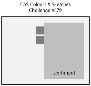
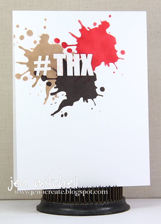
I based my card on the sketch at CAS Colours & Sketches. Instead of separate rectangular layer, I created a frame with some post it tape then colored in some stencils right up to the edge of the mask to create the impression that a rectangle is there. I had no idea how it was going to look when I started but I think it came out pretty good. (The sentiment was stamped in Versamark and heat embossed, which resisted the ink I used on the stencil). And I did another little substitution when I used a couple of enamel dots to take the place of the two little squares on the sketch. The challenge this week at Less is More is to use a stencil so that's what I did!
Thanks for stopping by and I hope you can join us at colourQ this week. Be sure to pop on by there to check out the inspiration from our design team!
Supplies
Stamps: Big Words (Mama Elephant)
Paper: Sweet Tooth (My Favorite Things); Pumpkin Pie, Whisper White (SU)
Ink: Cool Caribbean, Certainly Celery, Night of Navy, Pumpkin Pie (SU); Versamark
Accessories: Blueprints 20 die (My Favorite Things); Splatters stencil (Tim Holtz); enamel dots (My Mind's Eye); clear embossing powder
Despite the obviously feminine inspiration, the colors put me in mind of a more masculine design so that's the direction I took. I actually think this card is gender neutral, but since I left off flowers and butterflies I call it a man-card!
I based my card on the sketch at CAS Colours & Sketches. Instead of separate rectangular layer, I created a frame with some post it tape then colored in some stencils right up to the edge of the mask to create the impression that a rectangle is there. I had no idea how it was going to look when I started but I think it came out pretty good. (The sentiment was stamped in Versamark and heat embossed, which resisted the ink I used on the stencil). And I did another little substitution when I used a couple of enamel dots to take the place of the two little squares on the sketch. The challenge this week at Less is More is to use a stencil so that's what I did!
Thanks for stopping by and I hope you can join us at colourQ this week. Be sure to pop on by there to check out the inspiration from our design team!
Supplies
Stamps: Big Words (Mama Elephant)
Paper: Sweet Tooth (My Favorite Things); Pumpkin Pie, Whisper White (SU)
Ink: Cool Caribbean, Certainly Celery, Night of Navy, Pumpkin Pie (SU); Versamark
Accessories: Blueprints 20 die (My Favorite Things); Splatters stencil (Tim Holtz); enamel dots (My Mind's Eye); clear embossing powder
Tuesday, June 21, 2016
colourQ 347!
There was something very cool that appealed to me about the colors this week at colourQ. Despite the blouse-wearing model in the inspiration pic I could see these colors as masculine. And yet I could also see them as very warm and not-so-masculine. As is my habit when I see colors I go looking for a sketch and stumbled across this great one from Match the Sketch which tipped me into the masculine camp.
I used some translucent embossing paste to create some texture on the brown layer then dug into what I believe is the last piece of Blush Blossom card stock I own to cut those little squares. I wouldn't say I'm a huge fan of Blush Blossom but it is pretty and I confess to feeling a little twinge when I cut it. It's like the end of an era because I know of no color that is similar to it. Do you?
As you will not be surprised to read, our colourQ design team has created some really beautiful cards using these colors so be sure to check them out. I hope we get to see you in the gallery!
Thanks for stopping by!
Supplies
Stamps: Tech Talk (CAS-ual Fridays Stamps)
Paper: Smoky Slate, Peach Parfait, Blush Blossom, Chocolate Chip, Whisper White )SU)
Ink: Chocolate Chip
Accessories: Distress Grid stencil (Sheena); Pierced Square STAX (My Favorite Things); translucent embossing paste (Dreamweaver)
I used some translucent embossing paste to create some texture on the brown layer then dug into what I believe is the last piece of Blush Blossom card stock I own to cut those little squares. I wouldn't say I'm a huge fan of Blush Blossom but it is pretty and I confess to feeling a little twinge when I cut it. It's like the end of an era because I know of no color that is similar to it. Do you?
As you will not be surprised to read, our colourQ design team has created some really beautiful cards using these colors so be sure to check them out. I hope we get to see you in the gallery!
Thanks for stopping by!
Supplies
Stamps: Tech Talk (CAS-ual Fridays Stamps)
Paper: Smoky Slate, Peach Parfait, Blush Blossom, Chocolate Chip, Whisper White )SU)
Ink: Chocolate Chip
Accessories: Distress Grid stencil (Sheena); Pierced Square STAX (My Favorite Things); translucent embossing paste (Dreamweaver)
Tuesday, June 14, 2016
colourQ 346!
This week the palette and patteres at colourQ are perfect for a masculine card. I probably should have made a birthday card, but for I came across an old stamp set and decided to make a graduation card instead.
I used the layout from Sunday Stamps and although I really like how this card came out I have no idea what I am going to do with it! I don't know anyone graduating this year. And I usually try to make my graduation cards match the school colors of the recipient. I think I'd be hard pressed to find school colors as eclectic as this!
Thanks for stopping by and don't forget to pop on by colourQ and check out the inspiration from our fabulous design team. I hope to see you in the gallery!
Supplies
Stamps: Grads and Dads (The Craft's Meow); Ink Splats (IndigoBlu)
Paper: Bashful Blue, Night of Navy, Old Olive, Whisper White, Basic Gray (SU)
Ink: Old Olive, Basic Gray (SU)
Accessories: Pierced Rectangle STAX (My Favorite Things)
I used the layout from Sunday Stamps and although I really like how this card came out I have no idea what I am going to do with it! I don't know anyone graduating this year. And I usually try to make my graduation cards match the school colors of the recipient. I think I'd be hard pressed to find school colors as eclectic as this!
Thanks for stopping by and don't forget to pop on by colourQ and check out the inspiration from our fabulous design team. I hope to see you in the gallery!
Supplies
Stamps: Grads and Dads (The Craft's Meow); Ink Splats (IndigoBlu)
Paper: Bashful Blue, Night of Navy, Old Olive, Whisper White, Basic Gray (SU)
Ink: Old Olive, Basic Gray (SU)
Accessories: Pierced Rectangle STAX (My Favorite Things)
Thursday, May 26, 2016
CAS(E) This Sketch 174!
Oops! Totally forgot to post this Thursday morning! Must be from lack of sleep! Read on....
Here we are at Thursday again. I may have had a sleepless night last night because the night crews were out paving my street (I don't really know for sure because I'm typing this Wednesday night so I don't know if I slept good or not! LOL)! But it's all good because Thursday means a new sketch from your friends at CAS(E) This Sketch!
I had a bunch of different ideas about how I wanted my card to go for this sketch, but then I saw the masculine theme at The Challenge and decided that using some of the colors in the inspiration photo would be perfect. I don't have nearly enough masculine cards in my stash so any excuse to add one...
I made a card very similar to this a couple of years ago and for some reason it came to mind when I saw this sketch. From there it was easy to pick out some of the colors from The Challenge and CASE myself with a thank you inspired card. The sentiment was embossed first and the ink sponged around it using a stencil.
Thanks for stopping by and I hope you've got some time to join us in the CAS(E) This Sketch gallery this week!
Supplies
Stamps: Big Words (Mama Elephant)
Paper: Sweet Tooth (My Favorite Things)
Ink: Kraft, Smoky Shadow (Papertrey Ink); Ruby Red (SU); Versamark
Accessories: Splatters stencil (Tim Holtz); clear embossing powder
Here we are at Thursday again. I may have had a sleepless night last night because the night crews were out paving my street (I don't really know for sure because I'm typing this Wednesday night so I don't know if I slept good or not! LOL)! But it's all good because Thursday means a new sketch from your friends at CAS(E) This Sketch!
I had a bunch of different ideas about how I wanted my card to go for this sketch, but then I saw the masculine theme at The Challenge and decided that using some of the colors in the inspiration photo would be perfect. I don't have nearly enough masculine cards in my stash so any excuse to add one...
I made a card very similar to this a couple of years ago and for some reason it came to mind when I saw this sketch. From there it was easy to pick out some of the colors from The Challenge and CASE myself with a thank you inspired card. The sentiment was embossed first and the ink sponged around it using a stencil.
Thanks for stopping by and I hope you've got some time to join us in the CAS(E) This Sketch gallery this week!
Supplies
Stamps: Big Words (Mama Elephant)
Paper: Sweet Tooth (My Favorite Things)
Ink: Kraft, Smoky Shadow (Papertrey Ink); Ruby Red (SU); Versamark
Accessories: Splatters stencil (Tim Holtz); clear embossing powder
Tuesday, March 29, 2016
colourQ 335!
Hello and welcome to Tuesday which also happens to be the day of a new palette at colourQ! This week the colors are eclectic for sure!
I shamelessly used the sketch at CAS Colours & Sketches to create a little rainbow of rectangles using the colors, sticking a sentiment on the bottom one stamped on white. Easy peasy!
The colourQ design team had no trouble at all using these colors as you will see when you pop on over there. I hope you have some time to join us in the gallery this week!
Thanks for stopping by!
Supplies
Stamps: Celebrate Artsy (Stamplorations)
Paper: White (Spectrum Noir); Bermuda Bay, Calypso Coral, Cool Carribbean, Pumpkin Pie (SU)
Ink: Bermuda Bay (SU)
Accessories: Pierced Rectangle STAX (MFT)
I shamelessly used the sketch at CAS Colours & Sketches to create a little rainbow of rectangles using the colors, sticking a sentiment on the bottom one stamped on white. Easy peasy!
The colourQ design team had no trouble at all using these colors as you will see when you pop on over there. I hope you have some time to join us in the gallery this week!
Thanks for stopping by!
Supplies
Stamps: Celebrate Artsy (Stamplorations)
Paper: White (Spectrum Noir); Bermuda Bay, Calypso Coral, Cool Carribbean, Pumpkin Pie (SU)
Ink: Bermuda Bay (SU)
Accessories: Pierced Rectangle STAX (MFT)
Tuesday, February 26, 2013
colourQ 178
The colors this week at colourQ were a perfect excuse to sharpen my masculine card making skills. Especially since I saw that the challenge this week at Addicted to CAS was to make a masculine card!
The horizontal sketch layout at CAS(E) This Sketch had me stumped at first, but then I got the bright idea to line up thin layers of cardstock on an angle. I really like how it turned out. And, of course, in a case of me merrily making my card and not paying attention to the challenge, I had the whole thing put together ready for photographing before I realized that I forgot the Summer Starfruit. So I carefully pried apart my layers and stuck a piece of Summer Starfruit under the sentiment. Presto!
Don't forget to head on over to colourQ and check out the challenge and the other cards from the design team. They are amazing as always!
Supplies:
Stamps: WTF (CAS-ual Fridays Stamps)
Tuesday, April 17, 2012
colourQ 133
The colors this week at colourQ put me in mind of my neglected stamp set French Foliage. Normally I would only use this stamp set to make cards in autumn but the other day I was looking outside my window at my garden and realized that there were an awful lot of leaves in there that were going to need raking. So despite the fact that it is spring, I decided to break out this stamp set to sort of celebrate autumn all over again. It certainly seems to be making itself known in my garden anyway.
The colorful rick rack comes from the Tasteful Trim Sizzix die. The leafy layer begins with some Basic Black and has a Whisper White layer stitched on it with some thread that matches Dusty Durango pretty well. The leaves are treated to a little rock and roll technique with More Mustard and Dusty Durango. I finished it all off with a pewter colored Antique Brad and some white crochet thread.
I left off a sentiment on this one because I haven't decided what I will use it for. I think it may qualify in the man-card category so I just might use it for Father's Day.
I hope you have time to head on over to colourQ and check out Arielle's latest challenge. The design team has got some creative goodies to get your juices flowing too!
Sunday, November 27, 2011
CCMC177 and Paper Players 74
I wanted to make a holder for a CD that I got for my nephew for Christmas. The color challenge this week at Create With Connie and Mary gave me the perfect colors to make a masculine-inspired project. Then I thought it would be fun to adapt the sketch challenge at The Paper Players to fit the CD.
A funny thing happened on my way to making this project. I was typing away at this post and uploaded the picture only to realize that I used Sahara Sand instead of River Rock. Argh! I hate when I do that! So back I go to recreate the holder in the correct color. It actually was a little blessing in disguise because my original had a design flaw that was bugging me so this gave me the opportunity to fix it.
The long Night of Navy and Lucky Limeade layer is actually a belly band and the tilted layer and the to/from tag are attached to it so that whole thing slides off to get at the CD inside. The tree is from Perfect Presentation which I inked up in Lucky Limeade then embossed with clear EP. I mounted it on my tilted layer which I tried to dress up with a bit of faux stitching. In real life it's kind of muddy and I wish I hadn't done it, but I'm sure my nephew won't be so critical! The tag is from the aptly named To & From Tag and I added the button and baker's twine to jazz it up a bit. I followed a tip from Nance at Canopy Crafts about using a straight image on a tilted panel, which I like very much!
Thanks for stopping by!
A funny thing happened on my way to making this project. I was typing away at this post and uploaded the picture only to realize that I used Sahara Sand instead of River Rock. Argh! I hate when I do that! So back I go to recreate the holder in the correct color. It actually was a little blessing in disguise because my original had a design flaw that was bugging me so this gave me the opportunity to fix it.
The long Night of Navy and Lucky Limeade layer is actually a belly band and the tilted layer and the to/from tag are attached to it so that whole thing slides off to get at the CD inside. The tree is from Perfect Presentation which I inked up in Lucky Limeade then embossed with clear EP. I mounted it on my tilted layer which I tried to dress up with a bit of faux stitching. In real life it's kind of muddy and I wish I hadn't done it, but I'm sure my nephew won't be so critical! The tag is from the aptly named To & From Tag and I added the button and baker's twine to jazz it up a bit. I followed a tip from Nance at Canopy Crafts about using a straight image on a tilted panel, which I like very much!
Thanks for stopping by!
Wednesday, April 13, 2011
PPC55 Color Challenge
The color challenge this week at Picture Perfect Creations is what I consider to be a nice combo for a masculine card. I hardly ever make those, so it's a nice change for me!
I'm not sure why I always seem to associate a beautiful color like Not Quite Navy with a masculine card, but I do. And for some reason I also seem to reach for the Seeing Stars stamp set, when I need to make one. It's a very versatile set for kid's card, masculine cards, or even patriotic cards.
Thanks for stopping by and I hope you have time to stamp today!
I'm not sure why I always seem to associate a beautiful color like Not Quite Navy with a masculine card, but I do. And for some reason I also seem to reach for the Seeing Stars stamp set, when I need to make one. It's a very versatile set for kid's card, masculine cards, or even patriotic cards.
Thanks for stopping by and I hope you have time to stamp today!
Tuesday, January 5, 2010
MTSC55 For You
Although mentally I am in a Valentine's Day mode, I've decided to break out of that mode to use a color combo that I think is just fabulous. When SU! first came out with Basic Gray, I could hardly stop using it. It's still a favorite. And when you pair it with Kiwi Kiss - ooh la la. Delish! For this card I decided to use the fabulous Mercy's Tuesday Sketch Challenge. Now that I'm looking at this card, I think it could quite easily qualify as a masculine {gasp} card! For me, those are few and far between. What about you?
Thanks for stopping by and I hope you have time to stamp today!
Subscribe to:
Posts (Atom)