Wednesday, August 6, 2014

Freshly Made Sketches 148

Hey there!  This week I get to be the challenge hostess at Freshly Made Sketches and I designed an easy sketch that is full of simple squares and rectangles.  There's lots of room for interpretation in this one!  For my card I added in the colors at Just Add Ink because they are some of my favorites.  Take a look.


I love this label stamp set so much that I bought one of the Dymo labelers that puts out these plastic labels.  The reviews on Amazon were wishy-washy with several people complaining that after a few tries the labeler stopped working.   But I really loved the idea of creating my own labels in whatever sentiment I wanted so I dropped the $12 and bought it.  Well, guess what.  I made a few experimental labels that were perfect.  Then I went to make some labels for this card and the stupid thing won't work!  I think I'll  take it apart and see if anything looks amiss (cuz really, something IS amiss) but I'm really disappointed that the dumb thing won't work.

Now in case you haven't heard (and if you haven't it's because you haven't "liked" Freshly Made Sketches on Facebook or you haven't subscribed to the blog via email or reader - and why haven't you now that I think on it?) but this month we are thrilled to have Kim Singdahlsen join us as a Guest Designer!  She's a regular player and we are tickled pink that she'll be creating right along side us.  

Of course, the rest of the Freshly Made Sketches design team have got some great cards to show you so make sure you head on over there to check them out.  I'd love it if you took my sketch, created something fabbo as you always do, and joined us in the gallery!

Thanks for stopping by!

Supplies:
Stamps:  Dot Spot (Papertrey Ink); Label Love (Altenew)
Paper:  Stampers Select White, True Black, Harvest Gold (Papertrey Ink); Smoky Slate (SU)
Ink:  Harvest Gold (Papertrey Ink); Onyx Black (Versafine)
Accessories:  Dot Fade stencil (Tim Holtz); Translucent Embossing Paste (Dreamweaver)

Tuesday, August 5, 2014

colourQ 253 and Seize the Sketch 26

Happy Tuesday!  Today is the day for a new color palette at colourQ as well as a new sketch from Seize the Sketch.  The colors (inspired by this dress) as well as the sketch (designed by Katie Melus) are a match made in heaven!


I used a little grungy stamp for a background then went to town using the other gorgeous colors.  I wanted to use a little floral collage so I combined some old SU images with some new SU and created this.

Be sure to check out the colorQ and Seize the Sketch challenges.  There are cards there that are amazing!   Thanks for stopping by!

Supplies:
Stamps:  Flower Patch, Off the Grid, Raining Flowers dies (My Favorite Thing)
Paper:  Early Epresso, Summer Starfruit, Tim Holtz (has some energy party girl)
Ink:  Early Espresso, Summer Starfruit, Tempting Turquoise
Accesories:  Chocolate Iridescent sequins, Wink of Stella pen


Monday, August 4, 2014

Merry Monday 120

I've got some exciting news to share today!  Challenge creator and hostess extraordinaire Lesley asked me to be the featured designer at Merry Monday for the month of August.  How could I possibly refuse?  I get to design along side some super talented stampers and add to my Christmas card stash in one fell swoop.  Sign me up!

For this challenge Nina asked to use skis, skates or a sled on our card.  This, at first, gave me pause because I don't own any stamps with those images.  But luckily my friend Karren Johnson came to my rescue.  She stamped some sled images and mailed them to me.  (How lucky am I to have such a great friend).


Somehow I got it in my head that my sled would look pretty good as the focal image on a gate fold card.  So I set about creating a gate fold card that I could cut out with my Silhouette Cameo.  I think I did ok (even though my half circles don't exactly match up) but after I put this card together I had a look around the Silhouette store I realized I shouldn't have gone to all the trouble.  Yes, that's right, someone already created this card layout (which I could purchase for practically nothing) and I'm quite sure it's better than the one I made!

Before I go I just want to give a big shout out to Lesley and all the designers at Merry Monday who have allowed me to invade their domain this month.  I'm looking forward to a fun month with them!

Thanks for stopping by!

Supplies:
Stamps:   Two Feet Deep (Papertrey Ink)
Paper:  Chocolate Chip, Old Olive, Whisper White (SU)
Ink:  Early Espresso, Crumb Cake, Chocolate Chip (SU)
Accessories:  Two Feet Deep die, Rustic Jute Button Twine (Papertrey Ink); Pine Branch die (Impression Obsession); Cherry Cobbler Dazzling Details (SU) 


Wednesday, July 30, 2014

Freshly Made Sketches 147

Hello everyone!  Time for a new sketch at Freshly Made Sketches.  This week our hostess is Jennifer Timko and for those of you who like things in threes, this sketch is for you!  Jen is not only a great sketch designer she's also a great card-maker who loves showing us new techniques, great color combos and fun ideas!


I dug into my huge stash of DSP to make this card and let the colors of the paper guide me.  The colors are a bit subtle, but I love the little touches of black.

Be sure to check out the cards from our amazing Freshly Made Sketches design team this week.  Then link up with us.  We love to see you in the gallery!

Supplies:
Paper:  Sahara Sand, Basic Black, Pool Party, Sweet Sorbet DSP
Accessories:   Smile Word die (Lil' Inker Designs); Femme Frames die (Mama Elephant); baker's twine


Tuesday, July 29, 2014

colourQ 252

Our last colourQ palette of July features a bit of Christmas inspired by these delightful hand-made ornaments.  It's the perfect opportunity to use the colors to get ahead on some of your Christmas cards, or like some of my teamies have done, use them in a non-holiday way.  These colors are some of my favorites to use on Christmas cards so I jumped in with both feet and added another card to my Christmas card stash!


The latest Wanna Sketch gave me some ideas for my card, but instead of doing three separate banners I created one big one in burlap which I broke up with a red ribbon banner.  I think it's a fun interpretation of the sketch and lets me add some much-loved texture with this gorgeous burlap ribbon.  


And you may notice that the sentiment is slightly askew.  I blame it on the acrylic stamp that slips and slides on an acrylic block when it encounters even the slightest bit of moisture (read humid stamp room with no AC). This KaiserCraft set is one of my favorite Christmas sentiment sets.  I just don't understand why they make them from acrylic instead of photopolymer.  Acrylic doesn't take ink nearly as well as photopolymer and does the whole slip 'n slide thing, which is really annoying.  {Rant over, back to our regularly scheduled programming}.

Ok, so our always amazing colourQ design team have got some beautiful cards to inspire you.  Hop on over there to check them out.  I hope you can join us in the gallery this week!

Thanks for stopping by!

Supplies:
Stamps:  Modern Christmas (Clearly Besotted); Christmas Quotes (KaiserCraft)
Paper:  Kraft (Avery Elle); Early Espresso, Whisper White (SU)
Ink:  Certainly Celery, Early Espresso, Real Red (SU)
Accessories:  Real Red Stitched Ribbon (SU); Berry Blend sequins (Avery Elle); burlap ribbon

Sunday, July 27, 2014

A Note of Thanks

This past week I had one of those weeks at work that was totally draining.  By the time I got home at night I had no energy to cook, clean or even {gasp} make a card!  The last time I set foot in my stamp room was last Sunday and I was feeling very guilty about that.  Not to mention nervous because I had no crafty ideas running around my head that were bursting to get out.  But Saturday night I soldiered on and checked out some color and sketch challenges then settled in for some crafting.

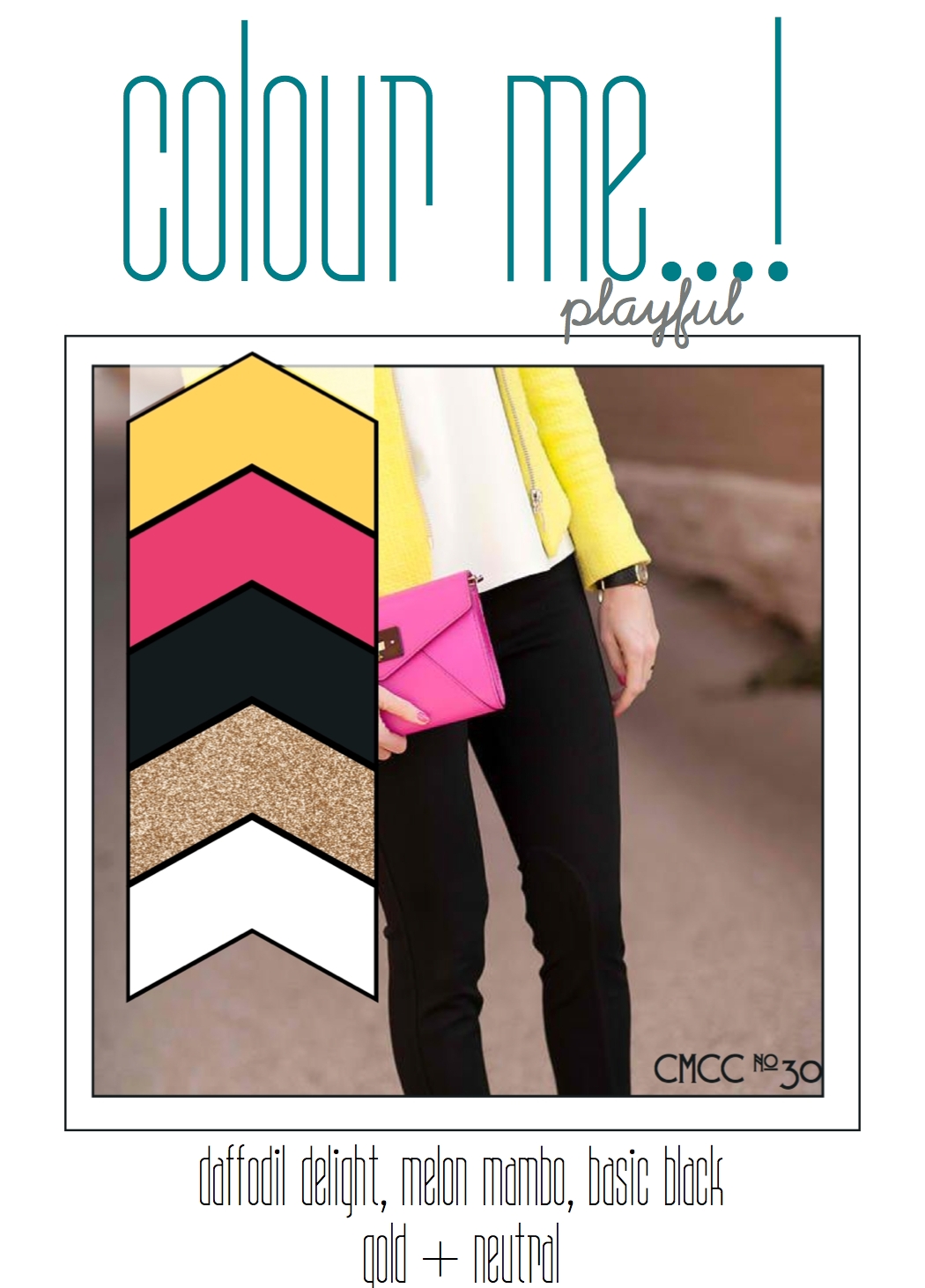
The first card I made I will refer to as "practice."  It was one of those cards that looked way better in my head than it did in the execution.  Too embarrassed to post it, I scrapped it and created something completely different.  Here is version two using the colors at Colour Me and the As You See It sketch.


Admittedly, the sketch had a layer with a fringe that seemed to extend beyond the edge of the card, but as I had nothing in my stamping repertoire that even remotely looked like a fringe I just went with a little piece of textured cardstock.

Well, I'm exhausted after all this creative thinking and am going to call it a night. (Yes, I'm typing this Saturday night with the post scheduled to go live on Sunday morning.  What would we do without the wonders of modern technology)?  

Thanks for stopping by!

Supplies:
Stamps:  Thank You Kindly (SU); Textures (Dina Wakely Media)
Paper:  Pure Luxury (Gina K); Basic Black, Whisper White (SU)
Ink:  Daffodil Delight (SU); Black Licorice (My Favorite Things)
Accessories:  Sprightly Sprigs die (Verve); Sentiment Strips die (My Favorite Things); Unforgettable Firsts enamel dots (My Mind's Eye); gold cord (SU)

Wednesday, July 23, 2014

Freshly Made Sketches 146

It seems like lately I've been running across more and more monochromatic color challenges.  This week I found one at The Paper Players that fit neatly into my idea for the latest layout at Freshly Made Sketches.  This week at Freshly Made Sketches our hostess is Amy O'Neill (who has got a great eye for design and is not afraid to mix bold colors for maximum impact)!  I suspect that you are going to love her sketch.


As soon as I saw the sketch I thought of my somewhat neglected stash of washi tape and I knew that I wanted to combine a strip of it with some of the images from SU's Gorgeous Grunge.  Luckily the color the washi tape matched the color of my ink perfectly!  I debated briefly about whether to add a flower or a butterfly as a focal image, and as you can see the butterfly won!

There are quite a few butterflies to be found on the cards from the Freshly Made Sketches design team this week as well as some floral images too.  Dare I say we might find a super hero or two among the cards in the gallery soon?

Thanks for stopping by!

Supplies:
Stamps:  Gorgeous Grunge (SU); Botanical Silhouettes (Papertrey Ink)
Paper:  Pure Luxury White (Gina K); Berry Sorbet, Sweet Blush (Papertrey Ink)
Ink:  Regal Rose (SU); Onyx Black (Versafine)
Accessories:  Chrissy Butterfly die, Leanna Butterfly die (Simon Says Stamp); Basic Rhinestones (SU); washi tape

Tuesday, July 22, 2014

colourQ 251 and Seize the Sketch 25

Happy Tuesday and welcome to my own personal installment of the new palette at colourQ and the new layout at Seize the Sketch.  I have no problem admitting that the colors, inspired by this bracelet, were really hard for me to combine!  The sketch, designed by Mona Pendleton, is a great one with lots of layers and room for embellishment and ended up working perfectly with the colors.


This card is kind of growing on me, but at first when I finished it all I could think is "what a hot mess this is!"  These colors, together, are not something I would normally put together but they really do work and after getting a look at the cards from the colourQ design team I saw how beautifully they can be combined!  

And I have another teeny weeny confession to make.  The bottom layer (with the polka dots) is Concord Crush and I had an old pack of SU buttons that I thought were the same color so I happily attached it to my card.  It wasn't until it was stuck fast that I realized the button is actually Night of Navy.  But honestly in real life the color of the cardstock and the button look identical!  Lucky me!

I hope you have a chance to play along with colourQ or Seize the Sketch (or both)!  We all love to see you in the gallery!

Thanks for stopping by!

Supplies:
Stamps:  Kinda Eclectic, Gorgeous Grunge (SU)
Paper:  Classic White (Flourishes); Concord Crush, Pretty in Pink, Melon Mambo, Whisper White (SU)
Ink:  Calypso Coral, Melon Mambo, Pretty in Pink (SU); White (WPlus9)
Accessories:  Chevron Stripe die (My Favorite Things); Springtime Vintage button, Basic Pearls (SU); Berry Blend sequins (Avery Elle); crochet thread