Sunday, July 31, 2011

My Cousin's Wedding

I'm sure like I sound like a broken record because I've been talking quite a bit about attending weddings over the last few months, but I've got another one today!  As far as I know it's the last one I'm going to this year.  Whew!  My cousin is getting married and the whole family is traveling "down the cape" (as we natives like to say when we are going to Cape Cod) so I thought I'd show you the card I made for the happy couple.  I can't take any credit for the design because I CASEd this card made by Sharon Johnson.

The wedding invitation was in shades of brown, so that's what I assumed the colors of the wedding party would be.  I like to make my wedding cards to match so I found some nice retired designer paper with pretty swirls (that I actually think is Close to Cocoa) and paired it with a layer of Chocolate Chip and some brown organdy ribbon.

Thanks for stopping by and I hope you have time to stamp today!

Saturday, July 30, 2011

Color Throwdown 152

I thought I'd attempt the Color Throwdown challenge this week because the colors are awesome!

So then I searched around until I found an interesting sketch.  One of the July Viva La Verve sketches caught my eye.

I know it doesn't look like it, but the flowers are really not the same color!  The larger flower layer is colored with Rose Red and the smaller one with Melon Mambo.  I was really surprised to see that the colors are so close, even in real life.  I think maybe I should have watercolored them to make them seem more different.

Well later today I've got a bridal shower to go to at my aunt's house.  It's supposed to be a lovely day and I think we'll be outside in the garden.  Should be a great time!

Thanks for stopping by!

Thursday, July 28, 2011

Color Lab Challenge 51

This is our fourth week of our Color Palooza at the ColorLab!  And this week we showcase the fabulous Calypso Coral.
I don't know about you, but last year when Stampin' Up! retired Cameo Coral I was very disappointed.   And to make matters worse, there was nothing even remotely resembling it to take its place.  Then this year we finally see a return of a very similar color.  Yay! Thank you to whoever decides these things at Stampin' Up!

For my card today, I used the FTL 150 sketch.


That beautiful butterfly is from the Summer Solstice set.  I new right away that set was going to be a favorite of mine.  I seem to be a sucker for all things butterfly lately!  And in keeping with the sketch I tried to leave some white space.

Thanks for stopping by and I hope you have time to visit us at the ColorLab and to create a project with our latest colors.  Don't forget to check out the design team samples for inspiration!

Wednesday, July 27, 2011

ColourQ 95 and Stamping 411 Sketch 213

The color challenge this week at ColourQ is all about some of the new SU! In Colors.

Look how fabulous these colors look together!  Those blues, the coral and a little bit of brown thrown in.  Ooh-la-la!  I could hardly wait to get started on a card for this.  And since it seems like forever since I made a card for the Stamping 411 sketch challenge, that's the sketch I chose.

I don't mind saying that Island Indigo is fast becoming my new favorite color.  If you haven't seen it I'm not sure that I can adequately describe how it looks.  It's too blue to be called teal and too dark to be turquoise.  It's too light to be a true indigo but it's not cobalt either.  In short, it is indescribable but entirely wonderful and I can't wait to use it again!

Thanks for stopping by and I hope you have time to stamp today!

Tuesday, July 26, 2011

MOJO 201 and Friday Mashup 16

Last night I thought I'd make a card for the MOJO sketch challenge and combine it with the Friday Mashup color challenge.

My stash of birthdays cards is mysteriously low, so I used this opportunity to begin a replenishment project.

Now the good thing about the "for you" sentiment I used here is that it can be used for a multitude of purposes.  It's appropriate for a birthday (when accompanied by a gift), or even for when the recipient just needs a "hey, I'm thinking about you" reminder.  Either way, it's nice to know that you are not alone and that your friends or family are nearby!

Thanks for stopping by and I hope you have time to stamp today!

Sunday, July 24, 2011

MOJO 200

Well yesterday, after a long day of travel, I made it back home from my vacation (although my luggage decided it was having a grand time in Philadelphia and stayed there overnight)!  Today I slept late, ran some errands then decided I had avoided my stamp room for too long.  It's been a while since I've held a stamp and cardstock and everything else that goes along with making a card in my hands and I'm a little nervous that my card-mojo has deserted me.  To get me back in the swing of things, I thought making a card for the latest MOJO sketch would be a good thing.  Maybe the MOJO could inspire my mojo!

The sketch had me optimistic.  A nice blend of circles and squares, a little ribbon, a vertical layer with somethng interesting going on.  I was ready to get to work.

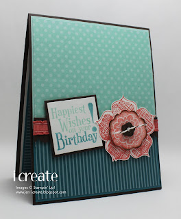
I really wanted to use some of the new In Colors so I looked at the Berry Blossoms dp and let those colors be my guide.  Among others, that dp uses Lucky Limeade, Calypso Coral and Early Espresso, which is what I used here.  I stamped three different sizes of the flower in Calypso Coral (stamping off the middle layer so it would be a little lighter and coloring the smaller layer with markers to get the Early Espresso center).  Then I oh-so carefully cut those flowers out.  They were a little tricky to cut, but my trusty snips did the job wonderfully!

Thursday, July 21, 2011

Color Lab Challenge 50

Welcome to week three of the ColorLab New Color Palooza!

This week features the awesome Lucky Limeade, which may replace Kiwi Kiss in my affections.  The jury is still out in that regard, but so far I like this color very much.

This is not a color combo that I would ordinarily put together, but as usual once I figured out my layout and the stamps I wanted to use, the color palette made perfect sense to me!  I used one of the stamps from Pocket Silouettes which I colored with my Riding Hood Red and Lucky Limeade markers.  The Perfect Plum layer is actually some Halloween paper from a few years ago!  It wasn't very Halloween-y  so I thought it would be a perfect accent layer.  I love doing that!

The layout is a bit unusual, but I thought it was pretty interesting so I thought I'd see what I came up with if I used it.  It's from a Taylored Expressions sketch challenge that I found in my "binder o-sketches."  It has no number and I couldn't find a link to it on the blog, so you'll have to believe me when I say that's the one!  I remained true to the sketch except for a ribbon that was supposed to go between the Lucky Limeade and Perfect Plum layers.

So I hope you have some time to hop on over to the ColorLab and check out the other samples from the design team.  I'm sure you'll find lots of inspiration to get you started.  And don't worry if you don't have the exact colors.  You can use whatever you have that is close (Kiwi Kiss anyone)!

Wednesday, July 20, 2011

PPA55

There was no way I was going to miss the color challenge over at the Paper Players.  Lucky for me the challenge ran for two weeks because of the Stampin' Up! convention so I was able to make a card early and post it while I'm away from home.


As usual, I see a card with Crumb Cake and I'm practically powerless to resist!  Add Basic Gray and I am in raptures!

I inked up my brand new Raining Flowers stamp set for this card.  And to add a little twist mixing some old with some new, I used some retired designer paper in shades of Basic Gray for the bottom half of this card (I don't remember the name of the paper, though.  Eek!).  I think I'm really going to like this stamp set.  It has some very interesting stamps and lots of two-step stamping potential!

Thanks for stopping by today!

Monday, July 18, 2011

Ben & Deena's Wedding

Hello from Willliamsburg, Virginia!

Although I'm on vacation in beautiful Virginia, I couldn't resist posting a few cards that I made before I left for my trip.  Today I thought I'd show you the card that I made for my nephew's wedding.  If you are a regular reader of my blog, you might remember that I was traveling to Charlottesville, Virginia to see my nephew Ben get married this past weekend.  I wanted to make a special card for him and his bride, and I stumbled on this beauty and knew right away that I would CASE it.  Here's my version:

I wish the color of my flower was as bold as Sandi's but I think it looks pretty nice anyway.  And I didn't think that I had enough basic pearls to fill in all those little circles, so I used Liquid Pearls instead.  I've used Liquid Pearls many times before and have always been happy with how it works, but for some reason I had a problem with it when I made this card.  Instead of looking like a pearl (as it's supposed to), the liquid flattened out and actually inverted itself in some cases so instead of a nice rounded little pearly blob, I ended up with a small pearly volcanic crater!  Not to be discouraged, I added more Liquid Pearls and it ended up looking ok, but I'm still not sure what went wrong.  I think that either the size of my "pearl" was too big and it ended up flattening out as it dried or the humidity in the air caused it to dry that way.  I'll probably experiment with it again to try and determine what went wrong.

I'll leave you with a fun picture of the "Beta Bridge" in Charlottesville.  My nephew met his bride when they were freshman at the University of Virginia.  Apparently there is this bridge (the Beta Bridge) on the grounds of the University that is used by local students who paint it when they want to congratulate someone for one milestone or another.  Apparently, at the last minute, the groom's brother thought it would be a good idea to paint the bridge with a congratulatory message the night before the wedding and he enlisted the help of the wedding party to help.  This is what they came up with.

The right side of the bride has the names of everyone who helped with the painting.  By the way, they painted this at about midnight and I have no idea how they did such a good job in the dark without decent flashlights!  After the wedding ceremony, the newlyweds drove by this and saw the handiwork of their friends and family!  I wish I had seen their faces when they did!

Thanks so much for stopping by today!

Saturday, July 16, 2011

ColourQ 93

I have scheduled up this post ahead of time, but I have been having some bad luck recently doing this, so I've got my fingers crossed that the post showed up on my blog some time Saturday morning.

This morning I left for Virginia for my nephew's wedding in Charlottesville.  I'm quite sure I'll be like the proverbial watering pot this weekend since I still can't quite believe he's old enough to be married.  But time marches on, and I must come to grips with the notion that he is not a child anymore!

Anyway, I'm sure you didn't come here to here about that, but to see what I've been doing with the stamps I got from the new catalog.  Today's card got me combining the ColourQ challenge with the Sweet Sunday sketch challenge.


I'm always a little afraid when I see a color challenge like this one at the ColourQ.  The colors are so diverse that I'm not sure that I can make a card that does justice to them all.  Invariably, I just start cutting and stamping until something emerges!

For this one I used the new Array of Sunshine hostess stamp set.  I stamped it twice in Peach Parfait, then cut out each layer (one of them smaller).  The smaller layer I adhered with dimensionals to the larger one, which is a look I particularly like. 

And I'm happy to say that I finally got a "hello" stamp!  A short while back I made a card and lamented that I didn't have a stamp that just said "hello."  It seems like such a versatile stamp to have, but unbelievably, I didn't have anything like it.  Then along comes the Posy Punch stamp set and "hello" has made it into my permanent stash!

Thanks for stopping by today and I hope you have time to stamp!

Thursday, July 14, 2011

Color Lab Challenge 49

Today is the second week at the ColorLab where we show off one of the new In Colors.  This week it is the beautiful Island Indigo.

When I first saw this color challenge I've got to admit that I was a bit stumped.  I couldn't seem to wrap my head around mixing up the Rich Razzleberry with those blue shades.  Then I put my card together and suddenly it all came together!  I've come to realize that this is one FABULOUS color combo!  Simply gorgeous!

The layout is one that I used a few weeks back and I really liked it so I figured I'd use it again.  As with the other card, I embossed the Island Indigo layer then heat embossed it with clear embossing powder.  The Baja Breeze designer paper you see is a retired one from the Walk in the Park set from many years ago.  I still have a tiny bit left so I used a scrap of it.  I really like the vertical stems on it since it went nicely with my floral accent.  I was undecided how I wanted to finish the center of my flower then I remembered that I had some Build-A-Brads in my stash.  I stamped a tiny flower in Rich Razzleberry then built my brad around it.  It makes a nice, bold accent for this flower.

Oh, and I haven't mentioned how utterly fabulous Island Indigo is.  I'm not sure I've seen a color quite like it before, but I assure you that it is SPECTACULAR!  I can't wait to use it some more.

I hope that you'll go on over to the ColorLab and check out the challenge this week.  And don't worry if you don't have the exact SU! colors for the challenge.  Just use something similar.  And be sure and check out the design team samples.  There's lots to inspire you!

P.S.  I think Blogger hates me.  This is the second week in a row that I've scheduled a post ahead of time and it hasn't posted when it's supposed to.  Grrrrrrr!

Wednesday, July 13, 2011

MOJO 199 and PPC 65

I fell in love with the color challenge this week at Picture Perfect Creations.

A little bit of neutral, a bit of black and a pop of color.  Yum!  Then I spied the latest MOJO sketch challenge and saw round layers that often seem to say "buttons" to me and I was off!


I ended up leaving the round layer round and switching out the bow for the button, but I'm pretty pleased with how this came out.  I used my long-neglected Greenhouse Garden stamp set, which was (at one time) one of my "go-to" sets.  Now I fear that it will see a period of neglect again because the UPS man paid a visit to my house yesterday and deposited a big box of fun on my doorstep!  I can't wait to dig in and try out all my new stamp sets.  I'm stamping quite sparingly this week as I've got a bunch of things I've got to do after work just about every day this week, but hopefully I'll get a chance to ink up my new stuff.  Stay tuned.  I'll at least be back tomorrow showing off a new ColorLab card which uses another of the new fabulous In Colors.  I'll hope you'll stop by and take a look!

Thanks for stopping by today!

Monday, July 11, 2011

PPA 101 and FTL 148

The challenge this week at Pals Paper Arts is brought to you by the color blue!  Lots and lots of blue!

I wanted to do a little something that was Clean And Simple for my card to really show off the blues.  First I noticed the latest FTL sketch, but I was a little intimidated by the circles so I decided to check out my "binder of sketches" to see if I could find something else.  Nothing really caught my eye so I ended up going with those circles!
And I don't mind saying that it was a little tricky making sure I had those circles lined up correctly.  I used grid paper, dotto, pencil marks and a few prayers to make sure I had them right!

So, I ended up following some true CAS roots for this one.  Lots of white space.  Yum!  Even though the circles were a little tricky I enjoyed the challenge of putting them all together!

Thanks for stopping by today!

Sunday, July 10, 2011

PPC 64: The hardest color challenge ever!

Last Monday I checked out the color challenge at Picture Perfect Creations and thought I was seeing things!  The Soft Suede, Peach Parfait, and Cherry Cobbler made picture perfect (pun intended) sense to me.  But wait!  They decided to throw in Pacific Point to make things interesting!

That's not so much interesting as downright scary!  I had no idea what to do, or how I could possibly make this work.  So I closed my browser window and decided to sleep on it for a few days.  By Sunday I figured I had evaded this challenge long enough so I picked the Stamping 411 sketch challenge to be my victim partner in crime.

The sketch was good.  Clean lines, lots of layers.  Everything I like in a sketch.  But pairing it with this color challenge was definitely challenging!

I decided to take a sort of color-block approach to this card.  Each layer is focused on one of the colors so that they sort of exist by themselves.  Actually, one of the first thoughts I had about this card was doing an image that I could color {a snowman with a colorful scarf} but to tell the truth, by the time I sat down to make this card, it was hours after the original thought and I had completely forgotten about that idea!  Oops!  So this is what emerged.  I'm not in any way sold on this.  It seemed so much better in my head when I was designing it! 

I'm glad I attempted this challenge.  It's fun to try something that you are a little afraid of, isn't it?  After all, it's only a bit of color, not bungey-jumping off a bridge or something! 

So on that thought I will leave you with good wishes for a happy Sunday!

Saturday, July 9, 2011

MOJO 198 and JAI 75

In a very strange sense of deja vu, the color challenge this week at Just Add Ink is eerily similar to colors I used on a card that I made the other day. 
It's been nice using Cherry Cobbler and Soft Suede again.  I tend to associate those colors with fall and winter so it's good to get them out and let them share the summer limelight!  I chose this week's MOJO sketch as my layout.
I was a little stumped about those two narrow, horizontal layers on the sketch.  I ended up doing the scrunchy ribbon thing on one and then just cutting a narrow strip of Basic Black and wrapping some baker's twine around it for the other.  Then I found some horrible black organdy ribbon in my stash that I used to create the bow in the corner.  I say horrible because the organdy ribbon I used is cheap, not very good quality, and since I've discovered seam binding ribbon everything else pales in comparison.  I think I'll have to get some in black so that I don't have use that other stuff ever again!

Thanks for stopping by today and I hope you enjoy your weekend.  I'm off to the garden to pull some weeds.  I swear that during the summer, weeding the garden becomes my part time job.  Too bad the work is boring and doesn't pay!

Friday, July 8, 2011

Sketchbook Saturday 18 and The Paper Players 54

I think I missed some kind of Christmas stamping memo because Christmas is the last thing on my mind now, but every time I turn around I see a Christmas in July challenge theme!  And this theme has carried over into other areas of my life too.  This past Monday I went to the 4th of July parade that my town hosts, and who do you suppose was sitting in the last float of the parade?  You guessed it!  None other than Santa Claus himself.  So I took this to be some kind of cosmic sign that I better get out my Christmas stamp sets and start inking them up.  The Christmas challenge at The Paper Players helped me along!

Once I decided on a theme, I wanted a sketch or a color challenge to get my creative juices flowing.  The Sketchbook Saturday challenge seemed to fit the bill.


I used some retired designer paper called Christmas Cocoa and Jolly Holiday to set the tone for the colors of my card, which are Very Vanilla, Soft Suede, Old Olive, and Cherry Cobbler.  I was a HUGE fan of the Jolly Holiday paper which was all about Old Olive and Cherry Cobbler.  I've got quite a bit of it left, so I'm sure I'll be using it again to make some Christmas cards soon. 

At least I hope it will be soon!  I'd like to get my Christmas cards done early this year.  This, of course, is what I say every year but is not what actually happens!  Last year I nearly got them all done in time for me to realize that I hadn't made enough.  This precipitated an emergency card-making night that I'm not sure I have recovered from yet!   This year I'm confident that I'll do better!!

Thanks for stopping by today and I hope you have time to stamp!

Thursday, July 7, 2011

Color Lab Challenge 48

ETA:  Oops!  Sorry this is posting so late.  I scheduled it to post this morning at 4:00AM but apparently blogger had different ideas!

Today at the ColorLab begins the first of five weeks where we showcase one of the new Stampin' Up In Colors.  This week, for your viewing enjoyment, we are creating projects with Wisteria Wonder.

I don't know about you, but I'm so glad to see the return of a lavender-ish color.  I'm sure you remember last year Stampin' Up! retired Lovely Lilac and Lavender Lace.  I was surprised to see them go, especially since there didn't seem to be anything like them to take their place.  But now, we've got this wonderful color that I would say is kind of a smokey-lavender.  I'm anxious to use more of it soon!

I mixed a little of the old and the new with this card.  The new is the Wisteria Wonder, the old is the Simple Friendship stamp set and the Afterthoughts stamp set - both of which retired on June 30th.  I generally keep all of my sentiment sets, even after they retire, because I don't think I can ever have too many sentiment sets!  I never know what I'm going to need to say to someone some day, so I'd be crazy to not keep them.  And there's no way I'm getting rid of the Simple Friendship set.  That butterfly is too gorgeous to part with!

Thanks for stopping by today and I hope you have time to play along with us at the ColorLab.  And don't worry if you don't have Wisteria Wonder.  Just substitute a similar color.  We'd love to see what you create!

Dn't forget to check out the design team samples.  They are sure to inspire you!

Wednesday, July 6, 2011

ColourQ 92

Well, I have recovered from all the 4th of July festivities enough that I found myself in my stamp room last night contemplating the latest ColourQ challenge.

I just love a color challenge that throws in a little bit of black.  It adds a bit of a dramatic accent, I think.

Since I still don't have my new, fun stamps to play with I went with the {fabulous} Fabulous Florets stamp for my card.  It's funny that as I check out my fellow bloggers it seems I'm not the only one who is anxiously awaiting her new Stampin' Up! stuff while simultaneously having trouble being inspired by the same-old stuff we've been looking at for months or (even years).  I don't ever remember being this anxious to play with new stamping supplies before, but there you have it.  I just got my shipping notification yesterday so it's probably another week before I see the new goodies.  And I'm not sure how much stamping I'll be able to get in next week since I'm preparing for a trip to Virginia to see my nephew get married!!  It may not be until the end of July before I get a chance to ink up my new stamps.  Oh the horror!

Anyway, I'll try not to keep whining about my lack of mojo as I hope that you are inspired to stamp today!

Sunday, July 3, 2011

PPA Turns 100!

One challenge that I like to participate in is the Pals Paper Arts.  It's hard to believe, but this week's challenge is #100.  Time flies, doesn't it?  And the Pals' challenge to us is to make a card using a favorite technique.  Well, that was a no-brainer for me, since my favorite technique is none other than the faux mother-of-pearl!  You're shocked, I can tell!

Anyway, I hunted around the blogosphere and thought that the Deconstructed Sketch and the Inkspirations Color challenges would fit the bill for my card.


I feel a little bit like I'm in some weird Stampin' Up! limbo land.  I've ordered all kinds of goodies from the new catalog, but I haven't received them yet.  And when I look through my stamps nothing seems very interesting to me!  I must be pining for my new stuff, since the old stuff in not very inspiring.  But, here's what I came up with for these challenges anyway.

I found some Baja Breeze patterned paper from the Urban Garden dp.  I'm not 100% sure that I like it, but I like to use up supplies in my stash, especially ones that have been hanging around for ages.  And I also used a Texturz plate on the Poppy Parade layer - something that I haven't used in a very long time.  Those don't give quite as deep an impression as the embossing folders, but when you need a softer look they are the way to go.  And I lightly mist the cardstock with rubbing alcohol first, because it seems to soften up the cardstock and makes a better impression.  (And it dries much quicker than water).

Thanks for stopping by today!

Saturday, July 2, 2011

Stamping 411 Sketch Challenge 210 and ColourQ 91

Every week I check out the color challenge at the ColourQ and every week I want to give the challenge a try.  Sometimes finding the time to participate in the challenge is difficult, but I love to when I can.  Today, I carved out some time to get inky with their latest challenge.

So, as I usually do, I find one challenge (either color or sketch) then I begin the search for another challenge to go with it.  This time I thought the Stamping 411 sketch challenge would be a good fit for what I had in mind.
I have to confess that even though I thought that this sketch would be "a good fit for what I had in mind" I had no idea what I had in mind!  Sometimes (actually a lot of times) when I pair a color challenge with a sketch challenge I make the decision purely on how well the number of layers of the sketch compare to the number of colors in the color challenge.  So when I decide that this color challenge will go well with that sketch challenge, I'm really guessing and ultimately taking a huge leap of faith!

Fortunately, this method seems to work out for me (although I've made some really horrible cards in my day), but this card is one that I'm actually pleased with.

The extremely talented Vicky has been using one of my all-time favorite stamps sets quite a bit lately (French Foliage), so I was reminded that I missed making cards with it and it was probably lonely just hanging around in my stamp room with nothing to do.  Of course, I put it to work on my card here and it's good to see it again!  Now, if you're thinking that the Night of Navy button seems a little out of place you're right! This was one of those instances where I had put my card together then checked the color challenge out again to make sure I had it right.  Lo and behold I had forgotten the Night of Navy!  So I added the button at the last minute, but I have to say that I think it looks pretty good.  It kind of messes up the sketch challenge, but not so badly (I hope) that I will be sent to the sketch challenge dungeon!

Thanks for stopping by and Happy July 4th to all my American visitors!